When designing a new website, there are countless factors to consider. What content management system (CMS) should I use? Should I use a pre-built theme? Should I go headless? Which pages should I include in my sitemap, and how should they be nested? What font and colour scheme aligns best with my branding? What should my primarily calls-to-action (CTAs) be? Should I prioritize the design of the mobile or desktop version of my website?
With these and many more questions in mind, it can be difficult to keep track and ensure you make the optimal choice in all areas. Beyond this, there are some critical areas that may be neglected by well-meaning web designers and developers, either due to lack of knowledge or even trying to keep the project budget tight.
In my experience, there are mistakes often made in web design, particularly with WordPress websites, that can be easily avoided if they’re kept top of mind.
Let’s explore some of these critical factors in web design.
1. Create a child theme
All WordPress websites are built around a “theme,” a collection of template files, stylesheets, and scripts which work together to create the basic design of your website.
Whatever theme you are using, whether it is the default WordPress theme, one purchased from a theme marketplace, or a custom one built by your web development agency, this will act as the “parent theme.”
A child theme is a copy that inherits the features of the core parent theme, but can be fully customized to your needs both in terms of looks and functionality. Essentially a child theme allows you to customize the look of the parent theme to your heart’s content without affecting the core files of the theme.
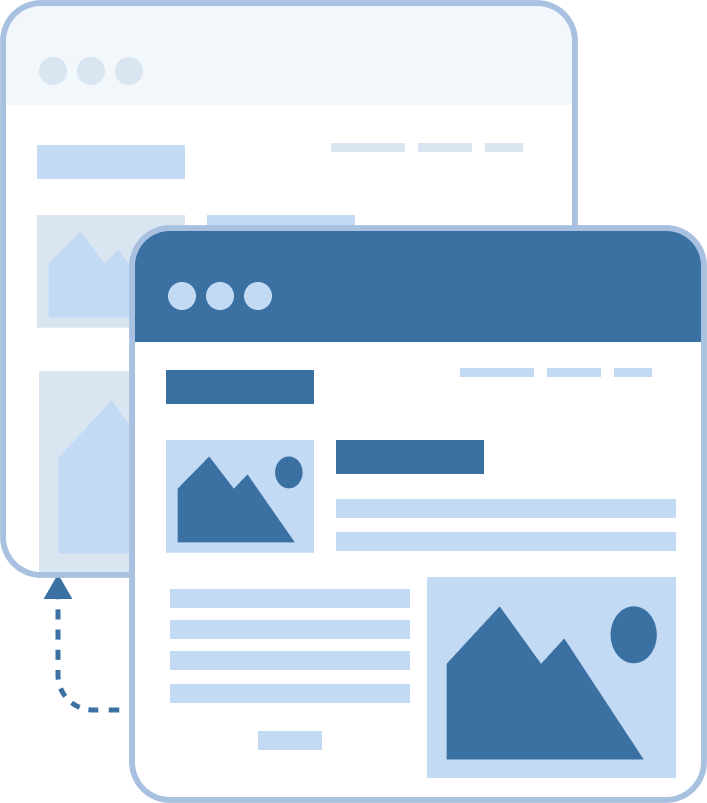
If customizations are built into the parent theme instead, they will be erased every time a parent theme update is performed.
This puts the website in limbo, as you either have to bypass parent theme updates or overwrite your customizations, wasting precious time having to recreate your changes.
If you choose to neglect parent theme updates in order to preserve your custom modifications, you will lose access to important websites which keep the theme secure, address bugs/glitches, and keep it aligned with WordPress core updates.
The simple and early solution is to create a child theme immediately and restrict theme modifications to these files.
2. Beware of plugin bloat
One of the major advantages of using WordPress is its expansive plugin ecosystem, with more than 50,000 plugins listed publicly in their library. These extensions, many developed by brilliant coders, bring incredible functionality beyond what is natively built into WordPress.
This massive plugin library saves developers the time, trouble, and money of having to custom code everything from e-Commerce functionality to web forms to pop-ups.

On the flip side, plugins allow developers to take “shortcuts” to implement functionality that really ought to be achieved through other means.
Why is this a bad thing?
For one, plugins need to be continually updated by the plugin author to stay functional, secure, and compliant with WordPress updates.
There is always the risk that the plugin author will abandon their creation, leaving your website vulnerable to stunted functionality at best, and a backdoor hack route at worst. (This article is just one of countless examples of an exposed vulnerability in a WordPress plugin.)
Malicious actors can exploit vulnerabilities in plugins and, if not patched, these can compromise your website.
Second, even well-maintained plugins can affect the speed and performance of your website by adding bloated scripts or running resource-intensive background processes.
Here are my recommendations for keeping your website free of plugin bloat:
- When building your website, determine which plugins are needed. Avoid plugin overlap (for example, don’t use Ninja Forms for your quote form and Gravity Forms for your newsletter signup; choose the best plugin and use it for both needs).
- When possible, try to avoid single-use plugins that could be custom coded or that duplicate existing WordPress settings. For example, using a plugin to add a favicon, when ability is already built into WordPress.
- Continually audit your plugins and ensure you’re still using all of them. For example, you might have installed a plugin to import content or duplicate pages when you were building this site. This is great, but if you don’t need to use them any more, deactivate or uninstall.
- Continually audit your plugins and ensure all are still supported by the original author. If you find one that is abandoned (the rule of thumb is two years with no updates), install an for an active, well-supported, highly rated replacement.
- Perform regular website maintenance and update plugins on a regular basis – as often as daily if possible. This will ensure any patched plugins are updated to the latest version as soon as available. and update plugins on a regular basis – as often as daily if possible. This will ensure any patched plugins are updated to the latest version as soon as available.
3. Don’t overlook SEO
“If a tree falls in a forest…”
A beautifully designed new website is little more than a vanity project if there isn’t a strategy to bring people to your website.
Search engine optimization (SEO) is the practice of optimizing your website to help search engines and users alike find and navigate your website.
While SEO implementations can be done after design and development is included, it is more time and cost-efficient to consider SEO from the beginning, as well as take care of certain implementations like optimized title tags and meta descriptions right from the start.
While you consider SEO from the beginning, items like choosing a fast, lean theme and avoiding slow-loading, resource-heavy plugins will be natural choices.
What does it take to incorporate SEO into your web design?
- Crawlability – ensure your site is crawlable, with a sitemap, no orphan pages, not blocking robots etc.
- Indexability – ensure your pages can be indexed by having accurate canonical declarations and avoiding issues like redirect loops.
- Accessibility – ensure your website loads quickly over HTTPS and doesn’t have any malicious content or security risks.
- Rankability – ensure your website has rich and deep content structured in a logical way, with descriptive URLs, hierarchical headings etc.
- Clickability – ensure your website is easy to navigate and optimized for the conversion journey.
With these factors in mind, your website will not only be beautiful – it can be an indispensable business tool.
4. Keep upkeep in mind
When designing a new website, it can be tempting to incorporate every possible bell and whistle. Wouldn’t it be cool to have a job listings section? How about images across the site that are updated seasonally? What about blog posts for all company events?
While these ideas are wonderful, they will require upkeep by your team or your web provider.
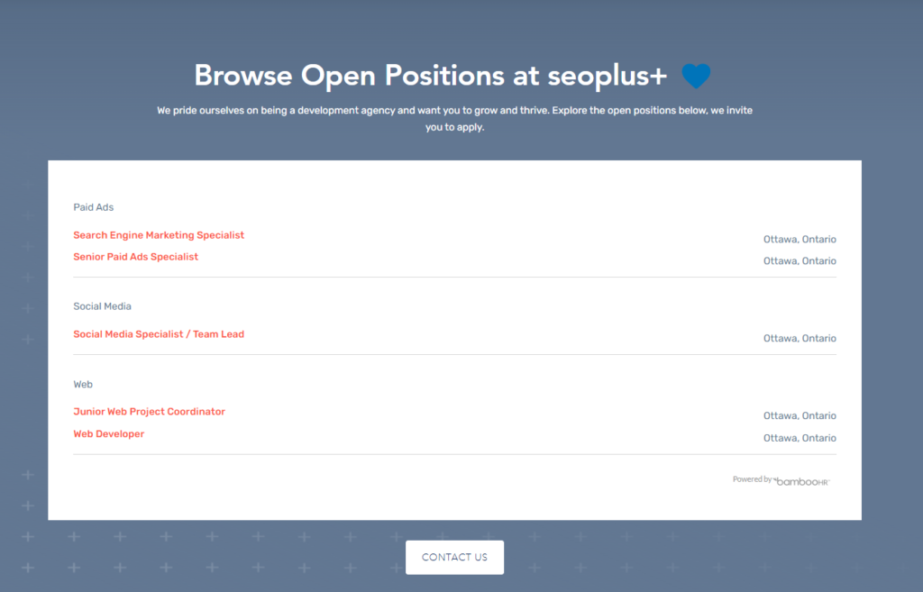
For example with a job postings page, who will be responsible for inputting the data, adding and removing listings based on availability? The last thing you want is to have an outdated page that leads to irrelevant queries for closed positions, wasting your time as well as the candidate’s. If there is a third-party tool that can automate this, syncing with a website like Indeed, that may be a better option.
If you have seasonal images, someone needs a task to update the pictures, otherwise it can look jarring to see winter pictures in the summer.

If you want blog posts for all company events, someone needs to be responsible for writing the posts and publishing them to the website.
For all these reasons, it is important to keep ongoing upkeep in mind when you are launching a new website. If it is not feasible for you to maintain all these different sections or features (or pay a provider to take care of it for you), it may be best left on the cutting room floor.
5. Accessibility matters
Web accessibility is a set of rules, behaviours, code standards, and design guidelines used to enable people with disabilities to use websites effectively.
Broadly speaking web accessibility is divided into three areas:
- Blind people using screen readers
- People with motor impairments who use only keyboards
- People with disabilities such as colour blindness or epilepsy who have challenges with UI/design components like font size or animations.

Web accessibility is growing in importance due to laws such as the United States’ ADA (Americans with Disabilities Act) and Canada’s ACA (Accessible Canada Act), which require most organizations and businesses to be compliant with the W3C Web Content Accessibility Guidelines 2.1 (WCAG 2.1).
Non-compliance could result in fines or lawsuits; even beyond this, it’s the right thing to do as more than 20% of the world’s population have disabilities and deserve an accessible web experience.
There are many ways to deliver partial or full web accessibility.
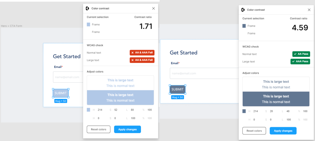
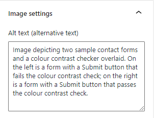
For example, one factor is to ensure sufficient colour contrast on buttons.
Another is to add descriptive alternative text (alt tags) to help screen readers communicate the information contained in images.
While such optimizations can be made manually, they do require upkeep as new content is added and web design changes are implemented over time.
Another option is to automate web accessibility with a tool like accessiBe, which uses AI to ensure ongoing accessibility and compliance.
Conclusion
Keep these critical factors in mind, and your new website will be much more than a beautiful digital experience. It will also be an accessible, maintainable resource to serve your customers now and well into the future.
Whether you need support with web design, are looking for guidance when it comes to SEO optimizations, or need ongoing web maintenance, our team of experts is here for you. Contact us and let’s talk about how we can help.
