The website navigation menu has its origins in the graphical user interface (GUI) of early computer operating systems. This GUI introduced the concept of using a visual menu to navigate through a computer’s file system and launch applications. It’s here that elements like the “drop-down menu” were created to allow users to reveal additional lists, commands, or functions when clicking a tab or a button.
In the modern day, web designers have adapted this concept to help organize website content and make it easier for users to navigate a site. This has led to the development of different types of menus, such as the hamburger menu for mobile devices and mega menus for more complex websites.
The website navigation menu is now an essential feature that helps users experience and access different parts of a website.
Why should I use a navigation menu?
A navigation menu on a website is a list of clickable links that help users navigate through different sections and pages of a website. Usually, these are located at the top of a webpage and provide quick access to different key areas of a site.
The benefit of a well-designed menu is its ability to help guide a user into key pages of the site that ultimately help fulfill their goal. Clear labelling and organization of this element can majorly impact how a user understands a website’s architecture and their ability to find the information they need.
Some of the primary benefits of a menu include the following:
- Easy access to information by organizing web pages into categories
- An improved user experience when designed intuitively and with clear labels
- Increased engagement by attracting user attention and giving a clear path to follow
- Better SEO by providing a clear map of the website’s structure to index pages
- Increased familiarity and trust when the navigation and design are consistent for returning users
If you choose not to include a menu on your website, your users may have less context for your website, they may do less exploration, and in turn, increase bounce rates.

Reference: https://mailchimp.com/en-ca/resources/navigation-menu/
Common menu labels
When browsing a typical website, you may come across various navigation labels that serve as signposts for users to help them find the information they’re looking for.
Some common labels you might see are:
- Home
- About Us
- Services
- Products
- Blog
- Contact Us
- Primary Call-to-Action button (like Call Us / Get a Free Quote)
These navigational labels act as a roadmap to guide users through the website’s structure, making it easier for them to explore the content and achieve their goals efficiently. Any friction at this point can cause frustration in the user and an increase in bounce rates.
Exploring the benefits of different types of menus
There are many different types of website menus available, each with its own unique benefits and drawbacks.
Below, we will explore the various types of website menus and their advantages in terms of usability, accessibility, and overall user experience. By understanding the different options available, you can choose the best menu type for your website and create a seamless user experience for your visitors.

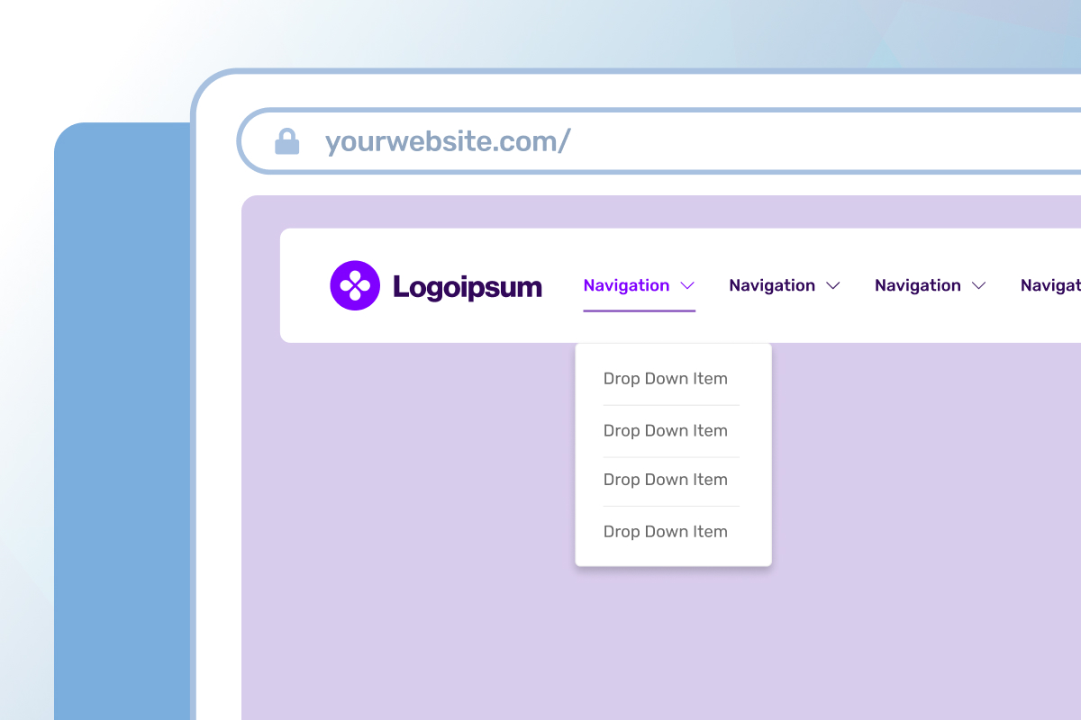
Standard horizontal menu
- 👠Familiarity – This orientation is widely used and will feel familiar to most users. Its recognizability and ease of comprehension make it a straightforward tool for users to navigate.
- 👠Space-saving – A horizontal orientation takes up minimal screen space, allowing designers to use more of the screen real estate for other design elements.
- 👎 Not mobile-friendly – Horizontal menus can be challenging for mobile users with smaller screens, especially with longer menus.
- 👎 Restrictive design – The fixed position and orientation of the menu can sometimes present challenges for websites that are particularly expansive or have an excessive number of menu items to display.
Overall, a traditional style standard horizontal navigation menu is a popular choice for many websites due to its familiarity and usability. However, it may not be the best choice for all websites, particularly those with a lot of content or a strong focus on mobile users.

Hamburger menu
- 👠Mobile-friendly – Hamburger menus are often used on mobile devices, where space is limited, making them a familiar and intuitive choice for mobile users.
- 👠Space-saving – Its compact design can save space on a screen, allowing for more content or other design elements.
- 👎 Navigation depth – Hamburger menus can limit the ability to display multiple levels of navigation, making it more challenging to create complex navigation structures.
- 👎 Discoverability – They can be difficult to find or understand for some users, particularly those who are less familiar with mobile interfaces or who have a lower level of tech-savviness.
Overall, a hamburger menu can be a great choice for mobile devices or websites that prioritize a modern and minimalist design. However, designers should be mindful of the potential drawbacks, particularly for users who may not be familiar with the hamburger menu interface.

Mega menu
- 👠Improved visibility – Mega menus can provide a more organized and efficient way to navigate complex websites with large amounts of content or multiple levels of navigation, especially when organizing items into categories or groupings.
- 👠Design flexibility – Mega menus can be customized to fit the design and layout of a website, providing more creative freedom to designers and developers.
- 👎 Complexity – Mega menus can be overwhelming for some users, particularly those who are not familiar with the structure of the website. This can lead to confusion, frustration, or accessibility concerns for those relying on assistive technologies.
- 👎 Limited mobile compatibility – Mega menus can be challenging to implement on mobile devices, where space is limited and touch screens can make it difficult to navigate complex menu structures.
Overall, a mega menu can be an effective choice for websites with a lot of content and complex navigation structures. However, designers should be mindful of potential drawbacks, such as overwhelming users or accessibility issues. Careful design and testing can help mitigate these issues and create a seamless user experience.

Vertical sidebar / full screen menu
- 👠Space efficiency – A vertical sidebar menu highlights the main content, either in the centre or on the side of the page, which helps to focus the user’s attention and eliminate distraction.
- 👠Mobile-friendly – Vertical sidebar menus can be easily adapted for mobile devices, making them a popular choice for responsive web design.
- 👎 Limited space – While a vertical sidebar menu can be space-efficient, it can also be limited in terms of the number of items that can be displayed, making some structures feel cluttered or overwhelming.
- 👎 Not always visible – Usually, a vertical sidebar navigation menu is not always visible to users. If the menu is hidden behind a hamburger icon or only appears on certain pages, users may have difficulty finding or understanding how to use it.
Overall, a vertical sidebar navigation menu can be a space-efficient and intuitive way to organize website content, particularly for larger sites, as it offers consistent navigation, is mobile-friendly, and is easy to use. However, the limited space may make it difficult to display all necessary items, and a cluttered appearance can overwhelm users.
Common issues with menu designs
Beware! When approaching the direction you wish to take your navigation menu design, stay aware of the most common issues that can impact the user experience for your web visitors.
- Overcrowded menus with an excess of options
- Ambiguous or inconsistent labeling of menu items
- Absence of visual hierarchy or grouping
- Inadequate responsiveness and slow loading times
- Non-conventional or confusing navigation layouts
- Incomplete navigation that omits key pages or features
- Lack of clear calls to action or essential actions
These issues can lead to frustration, confusion, and difficulty in finding what the user is looking for, ultimately resulting in a poor user experience.

Using best practices
In the first instance of landing on a webpage, a user is given the opportunity to take action. That first snapshot of the page (often called the above-the-fold view) is a crucial space for user engagement since it’s the first view they see. A rule of thumb is to ensure users can take action within the first 3-5 seconds of loading a page, so whether it’s a button in the hero section, or understanding the menu structure to dive deeper – it’s important to keep these high traffic areas strong.
When considering user scroll rates or the number of clicks above the fold, it builds an even stronger case that it’s the top of the page that should be the most direct and accessible.
Some best practices tips to consider when structuring your menu are:
- Begin with a site map – Outline a list of all pages and see if you can spot any themes or categories. This can help shape the structure of your content into menu items.
- Keep the user in mind – Remember that the user needs to understand the structure of your menu and how it can cater to their needs. Help them find what they need quickly.
- Use short but descriptive labels – Ensure the menu labelling is concise, but use descriptive enough words to avoid guesswork.
- Aim for 5 primary menu items max – Too many menu items may create a distraction for users and may cause users to lose focus of your critical pages.
- Include a CTA button – Great menus go beyond just linking users to a key page. Including an action button here (like get a quote / book a consultation / call now) is a quick way for users to take action right away.
- Use a sticky nav – Enabling this feature keeps the navigation anchored to the screen while a user is scrolling – keeping the menu always close by and accessible.
- Keep social icons in the footer – Keep your main menu focused on the actions and exploration of your site.
- Consider responsive menu design – Does your desktop menu align with the experience of your mobile menu? This is especially important if your site gets a high volume of mobile traffic.

How can seoplus+ help you?
If you’re looking for support in the areas of UX auditing, user testing, and strengthening the user experience of your website, reach out to us – we’d be happy to help your website grow!
Visit our website and learn more about UX design here.


