On one of my favourite podcasts about positioning for tech professionals, the host was interviewing a successful consultant and asked him how he managed to attract so much traffic with so little investment. His answer was not only short and surprising but also the ideal answer to a question many others tend to overcomplicate:
“I don’t care about SEO, I care about my audience.”
The host, a little surprised by the answer, probed further. “Then how do you care about your audience?” And therein lies the $64,000 question. The guest’s response was one simple SEO tip. Simple, but devastatingly effective:
“I look for questions people are asking, and I answer them.”
As simplistic as that might sound, the key to attracting higher levels of traffic — traffic that will turn into qualified leads and sales for your business — is to focus more on your users and less on Google. Even they said so:
“Google’s algorithms will also continue to evolve and continue to focus on the users and see what they need. If you’re just focusing on Google’s algorithms you’re always a step behind. So try to focus on your users and figure out what their needs are and what you can do to provide something that is really unique and compelling and different from everyone else in that area that you’re active in.”
John Mueller, Google’s Search Advocate
The question then becomes, should you ignore Google? No. But aim to deliver great content and a great user experience when enjoying that content, and you won’t have to worry about what Google thinks. Simply put, find out what your users want and give it to them. Adopt a user-first SEO approach rather than a Google-friendly one.
But to do that, you need to know what your users want.
What exactly is user-first SEO?
SEO’s job is to make it easier for search engines to find, parse, and gauge the relevance and value of your content, and match it to the search queries as closely as possible. But optimizing for the user’s journey goes beyond making your website findable, crawlable, and understandable.
The quality of the content and the user experience (UX) are essential to SEO. Both of these contribute to improving the search experience. I call this Search Experience Optimization (SXO).
However, the goal is to go beyond the query. When someone gets the answer they’re looking for, and it covers more ground, answers more questions, and does a better job than competitors, the user gets far more value in the end. Moreover, it allows them to end their research because they have all they need.
User-first SEO puts the user at the center of the search experience.
Keywords can provide some insights and keyword research is a good starting place. But a savvy SEO expert will want to fully understand the reason for the search, the intent behind it, and the best answer that matches that intent, along with the answers to all the other possible questions that a larger topical landscape can answer.
Keywords alone don’t capture all of those nuances. Questions, on the other hand, do — or at least do a better job. For this reason, the best content ideas don’t come from keywords but from questions. When you think about it, keywords are simply an abbreviated form of a question. But they leave too much out.
Questions are more specific, explicit, and targeted. For example, with “best mattress for back pain,” the question probably is: “What’s the best mattress to relieve my lower back pain?” But the question may also be: “What’s the best firmness (or brand) that will not cause back pain?”
How to boost your SEO with questions
Starting with keywords, you can uncover questions around them, as well as differently stated questions and other related questions, too. Be careful not to go down a rabbit hole, though. The purpose is not to write an encyclopedia on each topic. Just stick to what the user is looking for and think of everything they would want to know about it.
More to the point, think of the entire search experience.
The power of (search) suggestion
Analyzing the SERPs is one of the best research tools at your disposal. It provides you with a wealth of clues as to what Google wants, who your competitors are, and what other topics may be useful to the user’s search.
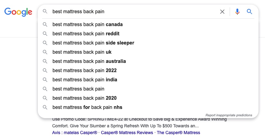
For example, Google’s search form offers autocompleted search suggestions. Also called “autosuggest” or “predictive search,” Google appends a list of suggestions as you type. You can also click at the beginning or in between keywords followed by a space, and Google will offer even more suggestions.
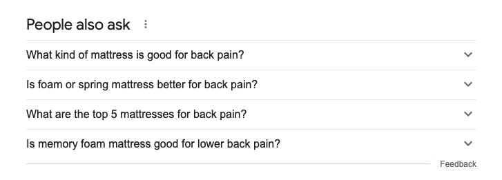
In the SERPs, a section called “people also asked” appears one-third of the way down. They’re additional questions related to the initial query, and clicking any of these will open up a brief answer with a link to the source. But it will also drill down further and offer a new series of questions from that point on.
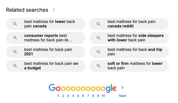
At the bottom of the page, there’s also a section called “related searches.” They’re similar to the predictive search suggestions at the top and provide additional ideas. They also offer more specificity if the initial query is not clear or too broad. Google’s additional term suggestions or variations and in bold.
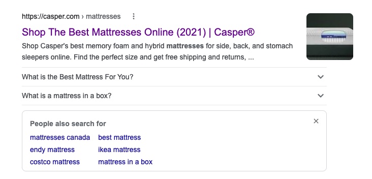
“People also search for” is a section that appears below a previously clicked result when bouncing back to Google. Called pogosticking (i.e., jumping back and forth between search results in an effort to find the best one), the bounce triggers alternative results in an effort to refine the search.
With any of these related suggestions and questions above, you can simply click one and it will lead you to a subsequent page with a whole new series of additional questions and related searches. Just rinse and repeat.
What about Google answers?
Previously, search engines offered question-and-answer discussion forums, such as Google Answers, Yahoo! Answers, and Live QnA (Bing). But moderation became a 4Chan-esque nightmare. Former moderators shared that the stress of dealing with flame wars, misinformation, threats, lawsuits, and trolls was too much to bear.
Search engines shut them down stating they no longer provided the user with a positive search experience, and they preferred to focus on what they do best, which is to provide high-quality, trusted content.
The pitfalls of discussion boards
I know this challenge personally. I used to run a very popular message board for copywriters back in the late 90s. But trying to chaperone over 100,000 passionate and opinionated writers was too difficult to keep up. When I had to start moderating the moderators to deal with the infighting, I decided to pull the plug.
Message boards can invite some of the most insightful discussions, but they also can invite a few bad apples that end up rotting the basket. In fact, “troll” is a term that describes someone who posts obnoxious, inflammatory, or defamatory messages on a discussion forum or in an online community.
Trolling originated as far back as the pre-Internet days. In the 80s, the online world consisted mostly of message boards, from Bulletin Board Systems (BBS) to Usenet newsgroups. As a young teen, I participated in many of them using an agonizingly slow 300-baud dialup modem and a monochrome, text-based line browser.
The online world sure has come a long way since then. But trolling, however, has not.
Discussion forums and boards
That said and in spite of the pitfalls, discussion forums are still quite useful when conducting research around the questions people ask. Some forums, particularly moderated ones in specific industries or around specialized topics, can be a tremendous source of questions to answer and content ideas.
In addition to discussion forums, look at questions people ask in online communities or websites where your audience congregates and on which they engage others, such as blog comments, social media groups, and even Slack channels. Chances are, you may be participating in one or more already. While the objective may be to participate or gain exposure, it’s also a great source of questions.
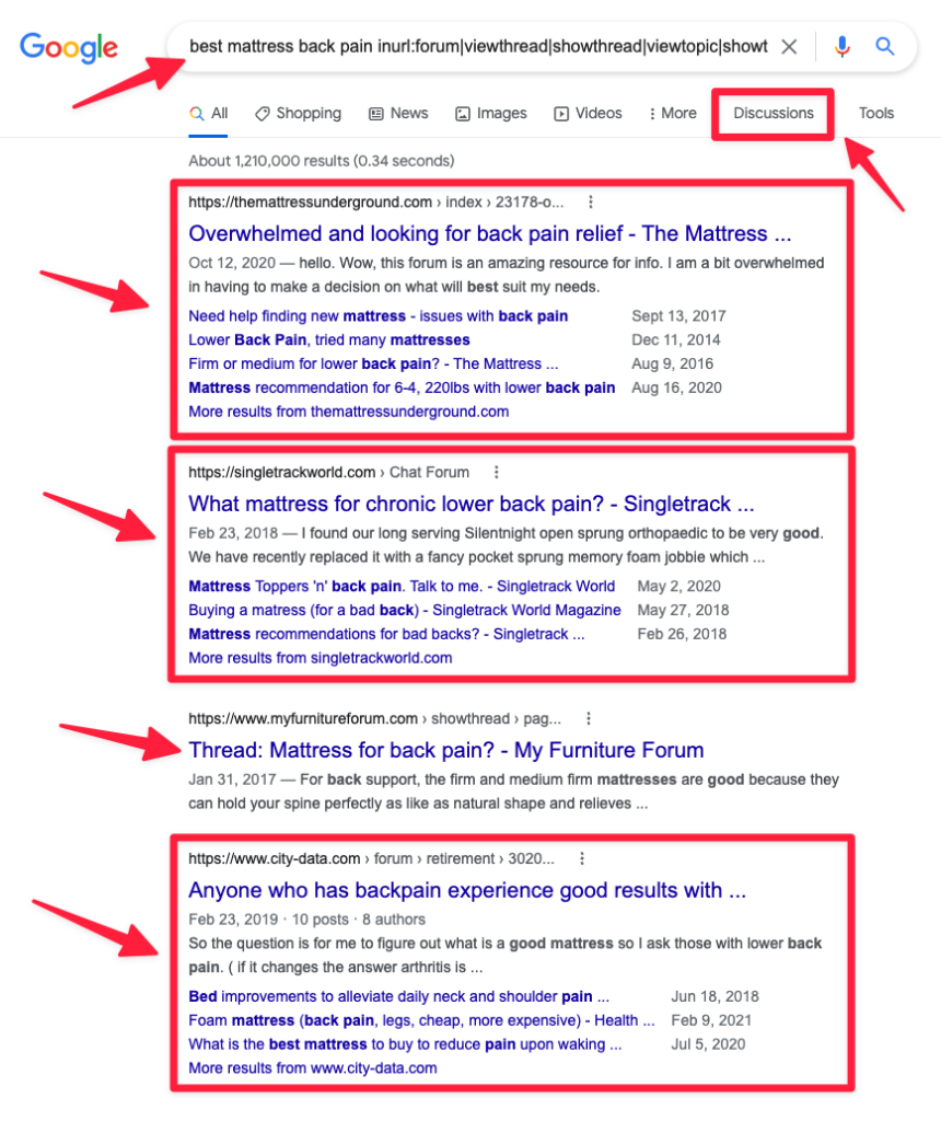
Google remains a great place to search inside these discussion boards. Google used to offer this functionality, which they’ve removed. But there’s also a Chrome extension that does the same job. Here’s what it looks like:
Some solutions will search inside discussion boards, online communities, and user-generated content, including posts and threads. The most popular ones are BoardReader.com and FindaForum.com.
For searching content on news sites, blogs, multimedia (such as podcasts), and social networks, there are tools like SparkToro and Buzzsumo. Additionally, some solutions will also search inside their comments, shares, interactions, reviews, and responses to those reviews. I found these to be rich sources of questions, too.
Advice submission sites and wikis
Sites with user-submitted questions, troubleshooting tips, and advice requests are also great sources of content ideas. Plus, users can upvote questions and the answers they like most. The three most popular ones are Reddit, Quora, and BlurtIt. For how-to sites, there are eHow, WikiHow, and Answers (formerly WikiAnswers).
There are plenty of others, but a few niche examples include:
- Inside.com: Topical news communities for professionals.
- StackExchange: Q&A communities around focused topics.
- StackOverflow: Troubleshooting forum for tech challenges.
- MetaFilter: The Internet’s oldest moderated Q&A forum.
- FixYa: Q&A site about DIY repairs and how to fix anything.
I suspect the success of these sites, unlike moderated search engine forums like Yahoo! Answers, comes from being self-policed. Users can vote up or down contributions, flag them, and become moderators themselves. Needless to say, votes themselves are great indicators of the types of answers people prefer.
Question curators and aggregators
These online services cull lists of commonly asked questions, and they drill down deeper to get clusters of related questions people may have about any given topic. These tools use Google’s suggestions mentioned earlier, but rather than manually checking pages upon pages of related questions, they save a lot of time.
Answer The Public
AnswerThePublic.com provides a list of questions collated from Google’s autocomplete search suggestions around a certain topic. It groups them by type and displays the results in a mindmap format. It also offers a “search listening” functionality, such as question monitoring and alerts around a given topic.
Also Asked
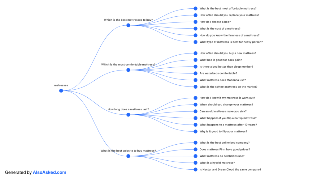
Where the previous one uses autocomplete suggestions, AlsoAsked.com pulls geo-targeted queries from Google’s “People Also Asked” suggestions, expands each question recursively, and visualizes their relatedness.
Answer Socrates
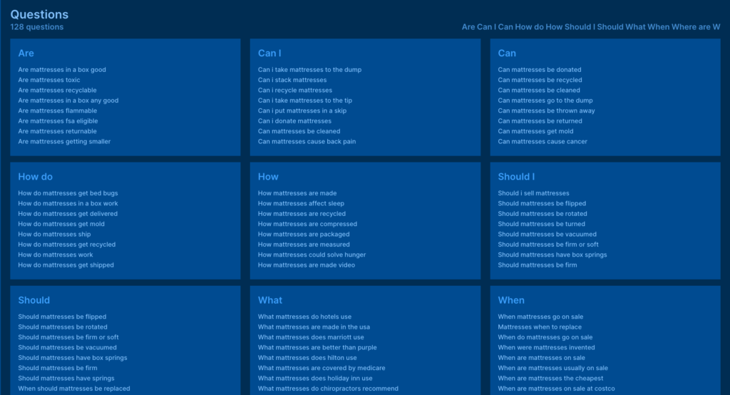
Like the others, AnswerSocrates.com compiles questions from Google Suggests and “People Also Asked” questions. But it also combines the results with Google Trends data for gauging their popularity.
Search Response
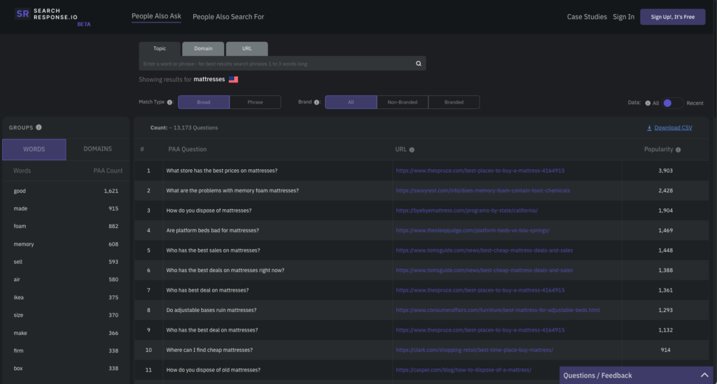
This one is similar except for two additional and worthwhile features. SearchResponse.io also pulls questions from “People Also Search For.” Plus, it can search based on keywords and URLs, which offers insights into what alternative questions people may have if they bounce back to Google from a specific web page.
There are plenty of other solutions I’m missing here, so this list is not exhaustive.
Personally, I use all of these but I also use Feedly, an RSS feed reader that can search for content, news, and insights from around the web. It can monitor topics, prioritize content according to popularity, and also search beyond RSS — including Twitter, Reddit, YouTube, podcasts, and even email newsletters.
How to create user-first content
The objective of learning about your audience’s questions is to create content that answers them. But before you do, and to ensure you answer them in a way that meets their needs as best as possible, the next step is to try to understand the intent behind those questions.
Search intent is what Google believes is the reason behind a query. It’s not only knowing what people are searching for but also why. This increases the efficacy and relevancy of their search results. The four types of search intent are informational (“to know”), investigational (“to go over”), transactional (“to do”), or navigational (“to go”).
But in addition to search intent, there’s also user intent.
As an SEO agency, our job is to understand not only what people want and why they want it but also how they’re going to use that information when they get it. Knowing the purpose of the search helps Google to enrich the user experience by answering any additional questions they may have or that are directly related.
For example, with “best mattresses for back pain,” the search intent is obvious: it’s to shop around for the best mattresses for back pain (i.e., it’s an investigational search intent). But is it to buy one or just to get pricing? Is it to compare them or validate an existing choice of brands? Is “best” based on relieving back pain or on preventing it (as the current mattress may be a cause)?
Of course, there’s no empirical way to know what the user’s intent is, short of breaking privacy laws or gaining psychic abilities. But the types of questions they ask provide clues as to the purpose of their research.
The stages of search awareness
In my experience, I have found that user intent tends to fall within the different stages of user awareness. The kinds of questions users ask typically become more specific as they progress along their search journey. To explain, let’s take a look at the five stages of buyer awareness. At some point along the journey, the user is:
- Unaware (they don’t know they have a problem);
- Problem-aware (they don’t know of any solutions);
- Solution-aware (they know of possible solutions);
- Product-aware (they know your specific solution);
- Most aware (they know a lot about your solution).
In a typical buying process, a person goes from being unaware of the problem to being aware of the solution, and choosing it from all the different ways to solve their problem. While awareness in marketing is based on the buying journey, in here I call it “search awareness” as it refers to the search journey specifically.
It may not always be about buying stuff. It may not be linear or well-defined. The lines between each stage can sometimes blurr, overlap, vary, or even change depending on the industry, market demand, complexity of the solution, the environment, and buyer lifecycles.
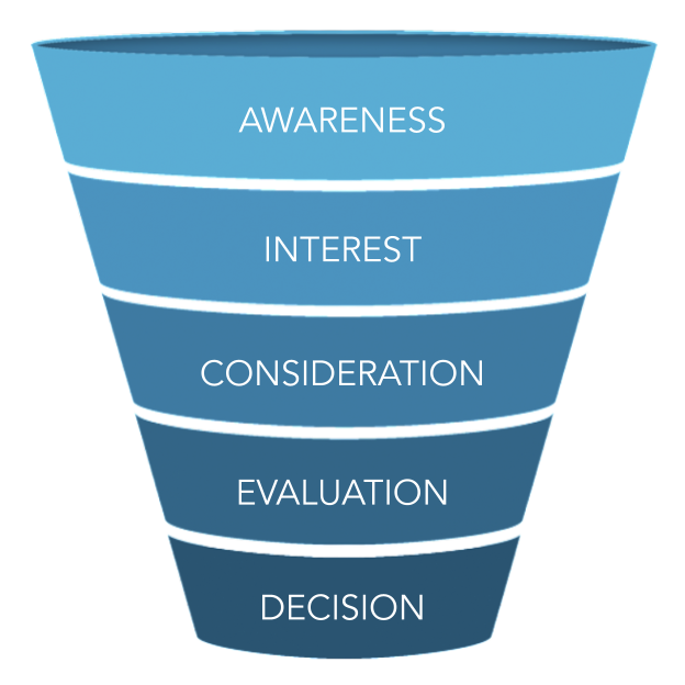
But for simplicity, it mimics a typical marketing funnel, going from the top of the funnel down to the bottom. The deeper into the funnel the user gets, the more aware they are and the more specific the questions become.
The search journey funnel
A search journey funnel, like any other marketing funnel, is simply a broad way of understanding the nuances of a search and the intent behind it. It’s to consider the various stages a user goes through along their journey.
Some funnels have only four stages (e.g., the “AIDA” model of Attention, Interest, Desire, and Action). Others have six, eight, and even 10 or more. It doesn’t matter how many steps or what you call them. The key is to understand that the type and specificity of the questions will generally indicate where the user is, where they will go next, as well as all other possible questions they may have at each stage.
Here, I’ll stick to five: Awareness, Interest, Consideration, Evaluation, and Decision.
Awareness questions
These are “I want to know” or “I want to know more” types of questions. They tend to revolve around a problem or pain point, whether obvious or not. The user wants more information about their situation, an issue they’re facing, or a challenge they want to overcome. For example:
- “Why do I always wake up with back pain?”
- “How do I sleep without back pain?”
- “Best ways to manage back pain?”
Interest questions
These questions are “I want to learn” or “I want to understand.” The user is interested in discovering potential solutions and learning about their efficacy — including alternatives that may be different but aim to solve the same problem. The user is exploring what they can do about their problem. They also want to understand how the solutions work and how well they work, too. For example:
- “Will a new mattress help my back pain?”
- “What mattress firmness relieves back pain?”
- “Can a pillowtop mattress cause back pain?”
Consideration questions
“I want to assess” or “I want to gauge” questions are more specific. Users are trying to assess which solution is superior or most ideal for them. Their questions may be about specific brands, features, or benefits in an effort to gauge their value. They may also seek to compare them against one another. Questions are not limited to features and benefits but may also be about any unique differentiators. For example:
- “Best orthopedic mattresses for lower back pain?”
- “Difference between pocket spring and memory foam?”
- “What are the benefits of a Sleep Number bed?”
Evaluation questions
These are “I want to verify” or “I want to validate” questions. The user may have a solution in mind but they seek validation for their decision. The intent may be to verify the quality of the solution or the veracity of its claims. The questions may be about (or they may be best answered by) demos, tours, trials, use cases, case studies, success stories, reviews, ratings, certifications, guarantees, warranties, etc. For example:
- “Can a Casper mattress go on a box spring?”
- “Serta mattress vs Tempurpedic mattress?”
- “How long do Posturepedic mattresses last?”
Decision questions
Finally, these are “I want to go” or “I want to do” questions. The user wants to know how to take a certain action or complete the transaction. Their questions may be task-oriented or related to making a decision, including location information, directions, product tutorials, maintenance tips, customer support information, total costs, next steps, additional needs, and so on. For example:
- “How often should I rotate my new mattress?”
- “Where to buy a Beautyrest mattress near me?”
- “When do Sealy mattresses go on sale?”
Be intentional with your content
Search intent is what search engines estimate to be the objective behind a search. You can easily guess the intent for a given query by looking at the search engine results pages or SERPs. They give you clues as to what Google thinks the user wants and the kind of results they provide in return.
There’s no way to know how Google’s proprietary algorithm works. But SEO specialists can determine search intent by observing the kinds of results Google provides. Similarly, there’s no way to know what the user wants without reading their minds, but you can determine user intent by observing the kinds of questions users ask.
Algorithms are constantly changing. Google can sometimes be unsure of the search intent, particularly when the query is short, broad, or susceptible to change. It’s one of the reasons why the search intent of a query changes sometimes, too. Focusing on the search engines puts you at the mercy of the algorithm.
But if you focus on the user, the algorithm will be at your mercy.
Why? Because the goal of every search engine algorithm change is to give users the best results possible. If you answer your audience’s needs, with the help of great content that’s relevant and provides value, you’re the one telling Google what are the results users want.
So stop chasing the algorithm. If you do, you will ignore the user and, as John Mueller said above, you will always be a step behind. Trying to satisfy both can become a neverending juggling act that ends up never satisfying anyone. Instead, focus your SEO on your audience and the questions they ask. Let the algorithm chase you.
How to create a user-first experience
High-value content is giving the answers your audience wants and deserves. But burying it deep in your website, making it hard to read, or having it take forever to load is going to fail in communicating that value. Simply put, great content without a great experience is just a great waste of time.
How you deliver the answers to your user’s questions is just as important as the answers themselves. They must be easy to find and easy to use. You must also deliver them in a way users will enjoy and appreciate.
Some call it the “content experience.” A positive content experience encourages consumption and engagement, while a negative one discourages them. But content comes in many forms, including user experience itself. While poor content creates a poor experience, I believe the converse is also true.
In fact, experience is content.
The user experience honeycomb
To explain how content plays a key role in the user experience, take a look at this diagram. The quality of the user experience has many facets. They’re interconnected and support each other. In an effort to better explain how they work, Peter Morville of Google created the UX Honeycomb back in 2004:
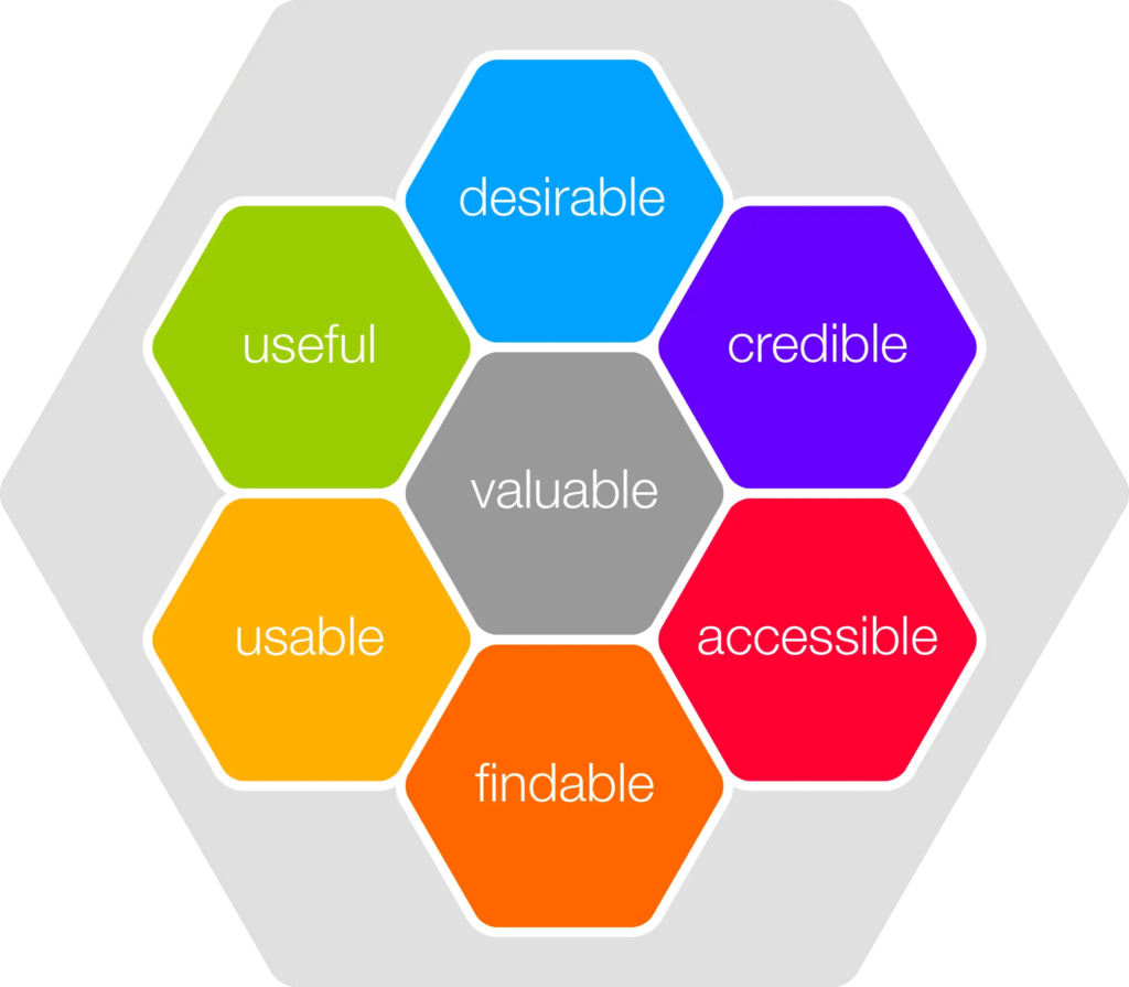
This diagram was meant as a teaching tool to show the different aspects of the user experience and how they work together. For website owners and SEO specialists, It’s also a useful checklist to ensure a website meets all of the important criteria. Here’s what each facet of the UX Honeycomb Model means:
- Usable: It should reach the desired outcome and be easy to use.
- Useful: It should solve a problem, serve a purpose, or meet a need.
- Findable: It should be easy to locate, navigate, and orient oneself.
- Accessible: It should be usable by everyone, regardless of ability.
- Desirable: It should be attractive, both visually and conceptually.
- Credible: It should be transparent, safe, secure, and legitimate.
- Valuable: If all six criteria are met, then it should add value.
All seven facets apply to the entire user experience. However, the top three are more about perception (i.e., what the user thinks or feels about your website), while the bottom ones are more about function (i.e., how they use it).
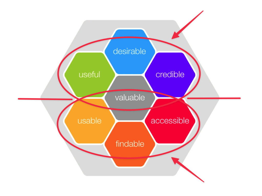
SEO consultant and former Google Search Quality analyst Pedro Dias, at a recent Search Marketing Expo (SMX) event, referred to the top three as being “strategical” and the bottom ones as being “technical.” It’s a great way to explain it as the elements fit perfectly within key aspects of SEO.
For example, to improve the quality of its search results, Google measures the level of expertise, authoritativeness, and trustworthiness of the pages it serves, called E-A-T for short. Its looks at a large number of E-A-T signals, which are then verified by a team of search quality raters who confirm the algorithm is working.
E-A-T aligns with the top three aspects of the UX honeycomb (i.e., desirable, credible, and useful). On the other hand, technical SEO is, in large part, about making sure the site is findable, crawlable, and indexable. That’s where the bottom three fit in (i.e., usable, findable, and accessible).
Both E-A-T and technical SEO play an important role in UX.
Use the UX honeycomb as a checklist to make sure everything is copacetic. Other than your content, most content management systems (CMS), like WordPress, Wix, Shopify, and many others, are technically sound and may need less attention. However, some technical aspects do need a little more TLC than before.
In fact, you can say they’ve become vital.
The crUX of the matter
Quality content is important to SEO. But quality content that’s unreadable, unusable, or unpleasant to consume is meaningless. So in an effort to help websites provide a smooth and seamless user experience, Google published a helpful set of metrics designed to measure the health of the page’s experience.
Google calls these metrics “Web Vitals.” According to their guidelines, Web Vitals are quality signals “essential to delivering a great user experience on the web.” They include things like safety, security, and accessibility.
But of those, a few user-centric performance vitals are now ranking factors and an essential part of the page experience Google is looking for. They’re a subset of Web Vitals, called Core Web Vitals, which are metrics that specifically analyze page loading time, responsiveness, and visual stability.

Largest Contentful Paint (LCP) measures a page’s usefulness by how fast it takes for its main content to load. First Input Delay (FID) estimates its usability by how long it takes to become responsive and interactive. Cumulative Layout Shift (CLS) evaluates a page’s enjoyability by how stable it is, without shifting or jerking.
Quality page experience, simplified
Applying improvements to Core Web Vitals can get quite complicated, and Google offers a helpful library of useful tips and code improvements. It’s also a big part of what technical SEO looks into. But when it comes to applying a user-first SEO approach, it’s really about ensuring a few essential things.
1. Fast-loading
People hate waiting for sites to load. Google does, too.
There are plenty of ways to achieve more speed, which will depend greatly on your platform (your CMS), the server that’s hosting your site, and your level of technical familiarity. For some, it’s choosing the right hosting solution, like our client Rebel.com. For others, it can be the delivery method, such as a headless CMS.
2. Easy to find
Nothing is more annoying than struggling to find what you’re looking for.
Content that perfectly answers your user’s questions won’t matter if you hide it or force users to jump through too many hoops to get it. This is more than making your navigation menu easy to find. Internal linking, adding clear markers, and above all, having the right content architecture will help. (I’ll come back to this as it’s important.)
3. Easy to use
If your site is difficult to browse, even if only a little, people will leave.
Users should be able to use the website without distractions, identify the page they’re on, understand the purpose of the page, and use the elements on the page, which should work as expected (such as buttons, links, forms, media, etc). Annoyances don’t simply impact your SEO, they can also impact your results and your business.
4. Easy to read
Noisy, busy, squint-inducing websites: great for bounce rates, terrible for users.
Readers tend to skim, scan, and scroll. If there’s too much going on, they will never start reading. If they do, don’t invite them to skim more with long, blurry blocks of text. Above all, if screenreaders and software like translators can’t make out what’s on the page, Google’s crawler won’t fare as well, either. Aside from being more comfortable and reducing eye strain, readability makes your content easily actionable, too.
5. Mobile-friendly
Tiny screens and variable Internet connections are no longer the exceptions.
Over half of all Internet traffic is mobile. Google now indexes primarily the mobile versions of most websites. It’s also the principal driver behind additional search features, such as Google Discover. So the less mobile-friendly your content is, the less value it will offer — and the less visible it will be in search results, too.
6. Safe and secure
Site warnings will not only hurt your traffic but also harm your brand.
Search engines are more reluctant than ever to send traffic to insecure sites. They will not only penalize you by reducing your rankings but also flag them in search results. Safety and security are not just an SEO or compliance issue. In many locations and with many industries, it can also be a legal one.
Ultimately, make sure your website follows the above six requirements. Meeting them, for the most part, should be relatively easy to do. Admittedly, some can get technical. Others can be easy to overcomplicate, too.
But to be simple, just be simple.
When it comes to the technical stuff, a user-first experience is more than just a pretty interface or having sound technical performance. If there’s one other aspect that can significantly increase the quality of the experience is to ensure that Google matches the right content to the user intent you’re aiming to serve.
For that, you must pay attention to your site’s content architecture.
How to create a user-first architecture
Good content and a good user experience are foundational to a successful user-first SEO strategy. But if users can’t find or understand the answers they’re looking for, that strategy won’t do much. How you organize your content and structure it in a way that fits the user’s search journey is just as important if not more so.
The key is to connect it all together.
Many web developers ignore content structure. With our in-depth SEO audits, I often discover that a site’s content is disjointed or disorganized, or doesn’t make sense from the user’s perspective. It’s hard to find specific content, let alone content that takes the user through their journey along the funnel.
When there’s no clear organization of ideas, or no situational or topical context, it often impedes the user’s experience and makes it hard for them to find the information they want. Here are some examples:
- Pages are linked in no particular order or buried deep where it takes several clicks to find them.
- The navigation menu has too many links, too few links, uncategorized links, or key links missing.
- Navigation is fragmented across the page, forcing users to search for where to go next.
- Main content has internal links to irrelevant pages that impede the user’s journey.
Whether it’s the lack of a clear structure or just poor site navigation, disorganized content can discourage both users and search engines alike. Organized content not only improves the user experience but also also creates topical relationships, makes related topics easier to identify, and provides meaningful context.
Called information architecture in UX, a site architecture is “the process of organizing, structuring, and labelling content in an effective and usable way.” To explain how it can help SEO, let’s take a look at the most common ones. There are essentially five major types of content architecture:
- Flat (or horizontal) architecture,
- Tunnel (or sequential) architecture,
- Pyramid (or hierarchical) architecture,
- Silo (or topical) architecture, and
- Thematic (or themed pyramid) architecture.
1. Flat architecture
A flat architecture is where all the pages reside on the main level. All the pages seem to be on one single tier under the root domain. Depending on the situation, this allows for shorter URLs and can be an effective SEO practice.

2. Tunnel architecture
A tunnel architecture is where there’s a home page, and all subpages are accessible only in sequence. It’s also called “strict hierarchy” because there’s only one way to access subpages, and that’s from parent pages.
While not as popular, some graduated learning portals use this type of linear architecture. It’s also quite popular with sales funnels and cart flows, such as a landing page leading to a shopping cart, a checkout page, an upsell offer, shipping info, payment details, and finally a confirmation page.

3. Pyramid architecture
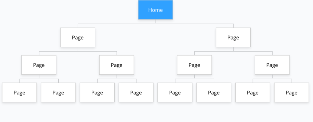
The pyramid site architecture is the most common one. It’s a hierarchical organization of pages and typically has several layers. It’s a combination of both flat and tunnel architectures, where each parent page has one or more child pages, which subsequently has one or more child pages too, and so on.
4. Silo architecture
The silo content architecture is the one SEOs most often recommend. It groups content according to topics. Each topical silo represents a category of pages. The main page at the top of the silo covers the main topic, followed by child pages that cover subtopics. The benefit of this structure is that it gives its subsequent pages context.
But a pure silo architecture is a double-edged sword.
On the one hand, it’s good for UX because it brings topics closer together and is better organized. But on the other hand, it’s bad for UX as it creates tunnel-vision browsing — like the tunnel architecture earlier, poor internal linking reduces navigability between pages, and it makes other content more difficult to find.
5. Thematic architecture
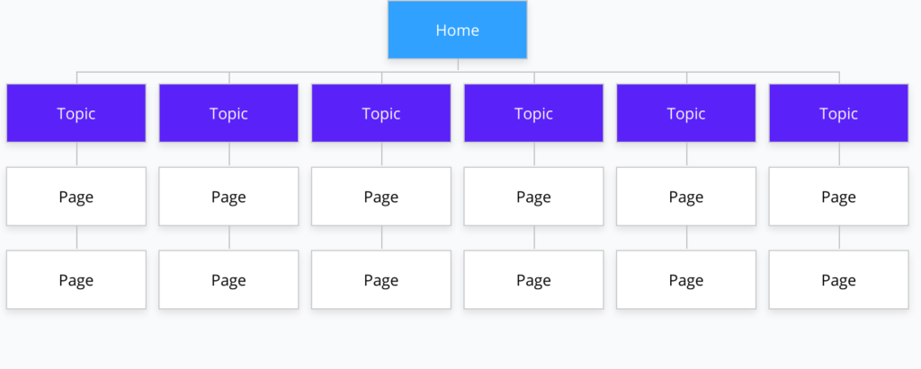
The pyramid site architecture is the one Google has publicly stated it prefers on several occasions. But unlike a randomized, unstructured pyramid, it groups pages by topic. Most SEO experts call them “themed pyramids” or “thematic architectures.” They’re a combination of both pyramids and silos.
Silos are the most popular form of site architecture that SEOs prefer. But it’s a misnomer. When SEO specialists refer to a silo architecture, they really mean a thematic pyramid. It contains silo-like pages, but each content silo can have a distinct set of content connections, with pages linked together, even from other silos.
For example, the blog may have its own article categories, while the shop section is organized according to product categories or collections using faceted navigation. But they may be semantically related across topics and linked together because both make sense to the user’s journey.
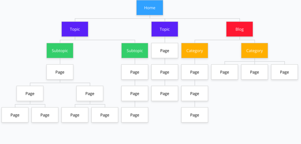
With an online mattress store, the URLs may look like this:
domain.com/
domain.com/about/
domain.com/shop/
domain.com/mattresses/
domain.com/mattresses/pillow-top/
domain.com/mattresses/memory-foam/
domain.com/mattresses/pocket-coil/
domain.com/mattresses/innerspring/
domain.com/mattresses/innerspring/single/
domain.com/mattresses/innerspring/double/
domain.com/mattresses/innerspring/queen/
domain.com/mattresses/innerspring/king/
domain.com/blog/
domain.com/blog/health/
domain.com/blog/health/best-mattress-back-pain/
domain.com/blog/health/mattress-sleep-disorders/
domain.com/blog/comfort/
domain.com/blog/comfort/firmness-level-sidesleepers/
domain.com/blog/comfort/memory-foam-vs-innerspring/
Every page doesn’t need to be in the navigation menu. They can direct people to internal pages that drill down further into more specific and related content — rather than stuffing mega-menus with thousands of links.
More important, silos make it easier for Google to understand the context of the page, and to more easily forward the signals to related areas of the site. For example, if an article about back pain falls under “mattress type” topic, then the user (and Google) know that it has to do with back pain as it relates to mattress types.
Holy clustering topics, Batman!
In the end, a user-first content architecture depends on the user’s journey.
For that reason, pages can be organized (i.e., using physical or virtual directories) or integrated (i.e., pages may not fall within directories but are grouped together using navigation, menus, breadcrumbs, and facets). They can also be integrated through internal linking, often into what’s called “topical clusters.”
A site may be connected like its own web and not necessarily follow a hierarchical order. Some pyramids may be topical while others may be functional. Some may be connected as they are semantically related but fall outside silos. And that’s OK. As long as it makes sense and guides the user along their search journey.
By linking information together based on their relatedness, it can help structure content in a way that makes it easy to find for both Google and your users, and easier to find additional, related information, too. More importantly, it provides context and nuance, as the user will choose the path that aligns best with their intent.
A topical cluster is also called hub-and-spoke content.
At the center of the hub is the main or pillar topic. Much like the parent topic in a silo architecture, this page connects to a series of subtopics or related topics, which may or may not fall within the main topic.
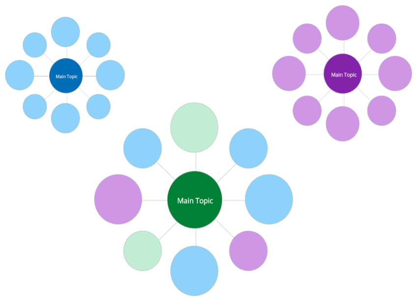
Search journeys are not always perfectly linear. In fact, they never are. They vary depending on the awareness level, environmental factors, and a user’s intent among others. The search journey starts with the answer to the question that drove the user to your site, then the answers to all the other questions they may have.
The goal is to deliver those answers in a logical manner that aligns with the user’s journey, which may or may not follow a strict hierarchical order — or any order, for that matter.
For example, say you have a topic about “mattress firmness.” Subtopics may include firmness levels, best firmness for side sleepers, support for heavier individuals, etc. Then you have one about “mattress types.” Subtopics may include memory foam, innerspring, pocket coils, etc.
Both topics have subtopics that are clustered together but distinct from one another.
Now, let’s say you have a third topic called “mattress for back pain.” You might have subtopics like lower back pain, upper back pain, arthritis, sciatica, etc. But you might have questions related to the other two topics, such as firmness levels and mattress types, and how each one may contribute to or help with back pain.
So unlike the first two, the third topic may cluster various subtopics from the others. It may link to them via internal links, suggested links, contextual links (i.e., anchor texts within the content), or navigation menus.
The benefits of breadcrumb navigation
Things may seem a little disorganized with thematic architectures and topical clusters. But as long as they make sense to the user along their journey, they will also make sense, in large part, to Google.
But one helpful strategy that can provide a sense of organization and create a stronger user-first experience is the use of breadcrumbs. They’re the links one sees typically around the top of the main content of the page that show the location of the current page within a particular hierarchy, silo, or cluster.
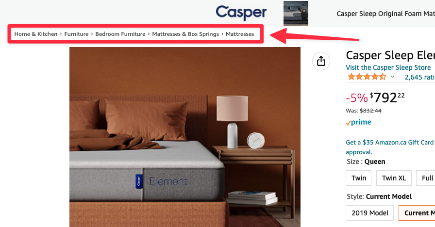
Breadcrumbs help make navigation more logical and orderly, and they reduce the time it takes for visitors to learn how to navigate the site. They also create situational awareness, giving users a sense of where they are, how they got there, and how far back they can go without going back all the way to the beginning.
Even Google uses them:
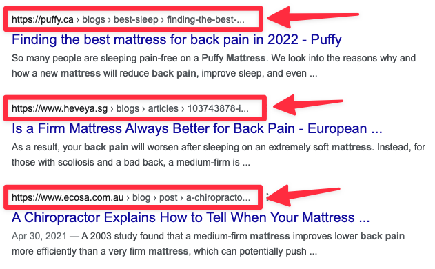
Breadcrumb navigation should never replace the main navigation. They’re only a helpful tool to assist users as they navigate through the site. They also provide situational context and may not reflect the physical position of the page within the hierarchy. They may be custom or dynamic to fit the path the user is taking.
There are mainly three types of breadcrumb navigation:
1. Location-based breadcrumbs
This type of breadcrumb navigation indicates where the user is located in the site’s hierarchy. It’s the most popular type of breadcrumb with multitiered architectures, and it allows the user to return to a parent page in the hierarchy without having to go back to the home page and start all over. Here’s an example:
Home Page > Parent Page > Child Page > Grandchild Page
2. Path-based breadcrumbs
Also called “history-based,” this type of breadcrumb is dynamic and reflects the preceding pages the user visited before landing on the current one. However, if the user first lands on a page within a deeper part of the site from clicking a backlink or search result, they will not have breadcrumbs to guide them through.
First Page > Second Page > Third Page > Fourth Page > Current Page
3. Attribute-based Breadcrumbs
This one is where the user sees the current page and the attributes with which it’s associated. These attributes are links to category pages listing all the other pages matching that attribute. It’s a popular method among ecommerce websites where a product’s attributes make up a pseudo-hierarchy. For example:
Store > Category > Subcategory > Variation > Product
In the end, breadcrumb navigation is quite effective in making a site easier to navigate. But it’s also very helpful in giving search engines more context, identifying content relationships, and turning silo architectures into pyramid ones using interconnected themes when some of them may fall outside their silos.
How to map out the user’s journey
There are a few critical things to consider.
First, any architectural change requires research, planning, and preparation. It’s the same thing as a site migration, which can be easy to mess up and lose rankings with. If you need to carry out a site redesign to implement the changes, or if you prefer making sure that it goes smoothly, then consider having SEO experts do it for you.
Second, it’s important to know what silos you need, including what questions your content needs to answer throughout the user’s journey, before applying any changes. It will guide the process of deciding on the site’s navigation and its internal linking strategy, and assist you in setting up important content relationships.
Third, defining the main topics, their subtopics, and any related topics, and then connecting them together by silos or clusters, will provide a better idea of how to organize content — as well as how to structure the site. Each content connection will give users (and Google) better context.
With those things in mind, here are the three steps to follow.
1. Start with a topical map
Armed with your audience’s questions, you have an understanding of the topics they seek. Using the search funnel mentioned earlier to guide you, assemble the topics together based on their relatedness and according to the user’s journey. If any content is missing, you now know what content you will need to create.
(After our SEO specialists develop strategies for our clients, creating SEO content to fill those important topical gaps is one of the most common and most important services our team of content specialists provides.)
In some cases, one comprehensive piece can answer a topic fully, including all its subtopics, on the same page. In other cases, a series of connected subtopics may be best. This is particularly helpful if a subtopic falls under multiple parent topics. Either way, the goal at this point is to simply map out the topics you need.
Think of the topic that would best answer each question.
Using the mattress example, a possible topic for questions at the awareness stage may be “back pain causes and solutions.” Another topic for interest-level questions may be “mattress types.” For the consideration stage, a topic may be “mattress benefits.” All three may flow nicely in one single comprehensive piece.
Topics (or subtopics) at the evaluation stage may include “mattress buying guide,” “mattress comparisons,” and “mattress reviews.” Finally, the decision stage may go into “mattress care,” “mattress store location,” and “mattress pricing.” A product description page or supporting site information can cover these.
For a great example, Casper does a good job with this blog post.
2. Match Pages With Topics
Create an inventory of your current pages, and audit the keywords for which each one is currently ranking. A look into your Google Search Console will provide you with all the information you need. By looking at the current keywords associated with each page, you will have an idea of what Google thinks your page is about.
With your topical map to guide you, ask yourself if any of your current pages and their associated keywords fit. With those that do, associate those pages with your chosen topics. In SEO, we call this technique “pagematching.”
If a page isn’t ranking for a topic you wish to rank for, and your website has been around for at least six months, then your content needs attention. It will either benefit from a rewrite, some additional optimizations, or a content audit to possibly consolidate parts of it. This, of course, is considering that your technical SEO is on par.
If some of the topics are not associated with any of your pages, you can find out what Google thinks is the best one for those, i.e., the page that best matches the keyword and the user’s intent. Take the list of topics you identified earlier in your topical map. Go to Google, and type in the following:
site:domain.com topic
“Domain” being your domain, of course. “Topic” is the topic you identified in your map.
Google will list what it thinks is the best page from your website that matches that topic. If your search turns up many pages, the topmost one is the one Google has determined to be the most relevant. Keep in mind that it may not be relevant to the user’s journey. (There’s also a possibility that a page may result in no match at all.)
According to the topical map you’ve just created, see if the pages fit within the clusters you’ve defined. If they don’t fit, then they need to be updated, consolidated with another piece (if the content has value), or deleted.
3. Connect topics together logically
Group pages in a way that makes sense to your user’s journey. Think of the question they’re asking, the stage of search awareness, and the types of related questions they may have at that point in their journey. It also helps to suggest navigation menu elements as users will choose according to their awareness stage.
Pages tend to revolve around the five “Ps.” They are:
- “Problems” (e.g., issues, challenges, pain points, concerns, dilemmas)
- “Products” (e.g., products, services, features, details, uses, alternatives)
- “Premiums” (e.g., benefits, competitive advantages, value-adds, USPs)
- “Proofs” (e.g., credentials, reviews, success stories, awards, demos)
- “Purchases” (e.g., transactions, location, special offers, contact forms)
Each “P” will also generally fall into a stage of the search funnel:
- Problem questions align with the Awareness stage.
- Product questions correspond to the Interest stage.
- Premium questions fit within the Consideration stage.
- Proof questions are part of the Evaluation stage.
- Purchase questions fall under the Decision stage.
Silos or clusters can be either one of the above or a combination of them. For example, features and benefits are part of “Products” and “Premiums,” respectively. They can be part of the same section and fall under one topic. Or they can be independent but connected through internal linking in strategic locations within their content.
Of course, each of the five “P” categories will vary according to the vertical, the client, and the market. For instance, an online store selling mattresses will vary greatly from a SaaS website. Just remember that the above categories are only guides and not goals. But with all things being equal, they should predominantly fall within those five.
Here’s the expanded snapshot of what the sitemap would look like:
- “Problems” can be articles that are part of the blog or in a “resources” section.
- “Products” can be product overviews, product categories, and product listings.
- “Premiums” can be use cases, reasons to buy, and unique benefit (USP) pages.
- “Proofs” can be “about us,” “why us,” buying guides, and success stories.
- “Purchases” can be the online shop, special deals, and contact pages.
Putting them together, you will probably end up with something like this:
It doesn’t matter how you decide to group the information together, just keep in mind that they should have a clear purpose and make sense to the user and their journey. The content they land on should answer their questions and predictively help answer all other subsequent questions they may have along their journey.
How to organize page content for SEO
Once everything is mapped out, what about the content on each individual page?
This is an important question, particularly with long, comprehensive pieces of content. When a page covers many subtopics to answer many questions, it’s fine and recommended. Most top rankings generally (but not always) consist of long-form content. However, the issue is that it can also become cumbersome and disjointed.
The structure of the content on a page must follow a logical flow. Otherwise, users will be confused as to what sections are, how they fit into their journey, and what’s the next logical step. Plus, the answer to a specific question may be buried deep within the page. If no one can find the answer to their question, it won’t matter.
For this reason, a properly structured page is important for user-first UX.
But it’s also important for Google, too. Recently, they introduced passages ranking where a page can rank based on relevant passages. It’s Google’s way of sifting through the content, finding key passages, and determining the context of these passages to rank the page according to specific queries.
Google’s end goal is to provide the best experience to the user. If Google believes that the passages on a page are more relevant to a query than the overall content, they’ll rank these pages differently. From what we know, Google will isolate the sentence, phrase, paragraph, etc. that it deems most relevant, and will then rank the page based on that specific content.
Hayden Rober, Acadia Digital
Passages ranking gives Google an opportunity to understand the various parts of the page, and it allows them to differentiate the topics of different passages and rank them. For example, a page as long as 3,000 words or more can easily rank for 20, 30, or even 50+ keywords, as opposed to ranking for 10 or fewer.
Passages ranking and user-first SEO
Should you optimize for passages ranking?
In a recent interview, Martin Splitt from Google said that passages ranking will be particularly helpful for websites that have long-form content. By looking at sections of an article rather than the entire page, Google can understand the content better and help users get better-matched answers to their questions.
But he also said that there’s no way to optimize for it other than to keep creating great content and organizing the content in a logical, easy-to-consume manner. That last part is important.
If a page covers a topic fully, when Google crawls these pages it will try to read and understand what it finds. If a page is poorly structured and content is all over the place, either by being disorganized or fragmented, it’s hard for crawlers to identify and classify the information it’s crawling.
The goal, therefore, is to group and organize content better on the page, and identify groups clearly. Just as landmarks help people situate themselves in the real world, landmarks on a long piece of content help users to locate where they are and what the section is all about.
The most effective types of page landmarks are content headings. Headers and subheads throughout the page are not only useful but also excellent signals that give Google context about the surrounding content.
For example, say you have a page that covers the topic of back pain. A section has the heading, “Best Mattress Types For Back Pain.” A user’s search may contain those exact keywords or be in the form of a question, such as: “What types of mattresses help back pain?” With this passage, there are several SEO benefits:
- Being in the form of a question, the header is likely similar to the user’s query.
- Although not guaranteed, a closer match raises the chances of ranking well.
- It also sends other SEO signals, such as importance, relevance, and quality.
- It’s identifying the section that follows as the passage that contains the answer.
- It’s also isolating itself from other subsections let alone the rest of the page.
- By virtue of being among other related information, it implies thoroughness.
Therefore, if your current pages have content that’s fragmented or out of order, it’s best to edit or rewrite it to cluster the content around subtopics. Incorporate headers (e.g., H2, H3, H4, etc) throughout. H1 is for your headline, and the rest should nest appropriately — that is, all H3s should follow H2s, not H4s.
Finally, other landmarks include supporting visuals that aid comprehension, support the surrounding content, and add additional text with the help of alternate details and captions, which offer even more context.
Structuring your content semantically, and helping users identify subtopics, will raise not only the quality of your content but also its UX, particularly accessibility. Landmarks help people find the exact information they want by scanning the page. But it also helps screenreaders, software, and other machines that depend on them.
Machines are becoming user-first, too
Speaking of machines, SEO used to be about optimizing content for machines, not humans. That worked to a large degree for a long time. But Google wants to give its users great content and a great search experience. The more robotic the content appears, the less appealing to humans it will be.
Writing for machines negates both.
Google is becoming increasingly sophisticated, with its deep learning algorithms such as RankBrain, neural networks, and knowledge graphs, among others. Its use of Natural Language Processing (NLP) and Natural Language Understanding (NLU) can help them read, process, and understand language the way a human does.
Google has also introduced a new algorithm that breaks down queries even further to understand them better. Called Multitask Unified Model (MUM), it’s a form of NLP that helps Google to understand all of the different ways people naturally communicate and interpret information, whether it’s with words, sounds, or images.
Essentially, Google wants to remove itself from the search equation by thinking and acting as a human user would. So it goes to reason that optimizing content for users first is also optimizing it for Google. In fact, the best way to optimize for the passages ranking algorithm, or for any ranking factor for that matter, is to be more human.
So by using a user-first approach, you’re helping Google, too.
Think of how your readers would read the page. Avoid making content look like unstructured blobs. Provide markers throughout to help contextualize sections, and to create internal relationships within a piece of content. In fact, semantic elements like headings shape the content that both humans and machines prefer.
Some user-first SEO best practices
In a recent SEO audit we conducted for Statistics Canada, a department of the government of Canada, I came across their official content guidelines that advise against using long FAQs. From a user experience perspective, FAQs make users sift through wordy collections of questions, many of which are irrelevant to their tasks.
When you design navigation from the perspective of your audience, you consider the tasks that they are trying to complete. Instead of lumping diverse concepts or details together in a single spot, you create clear paths to actionable answers. You identify the top tasks your audience wants to accomplish. Then you organize your website navigation in a simple and logical way to help them succeed.
The Governement of Canada
Alternatively, they recommend as we do to use headers throughout the content, which help users scan the page and find the content they want. Sometimes, according to StatsCan, it’s better to use straightforward headings as opposed to questions, since doing so front-loads keywords and makes it easier to scan.
As mentioned previously, group sections around subtopics or ideas, and add succinct headers throughout the page and before each section. But if the page contains large sections, break them down into smaller ones, each preceded by hierarchically smaller headers to indicate they’re subsections.
Prioritize sections by organizing them in a logical format that makes sense to the user’s journey. Link content together with internal links, including and most importantly a table of contents at the top of the page.
Longer articles that contain a table of content at the top or a summary with a list of jumplinks to sections on the page provide users with an at-a-glance overview of what the page contains. It’s also a helpful way to jump directly to sections of interest rather than having to scour the whole page to find specific topics.
Listing your headings at the top of the article and even inserting anchor links with each one that jumps to each section, such as by adding anchor tags with each header, is also useful.
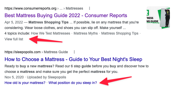
It’s not a ranking factor, but a TOC can help Google understand passages contextually. Another indirect benefit is that Google can choose to display a menu of topics and anchor links below SERP listings. This will likely increase clickthrough rates (CTRs) from them, which provides Google with positive feedback.
As part of Search Experience Optimization (SXO), a listing with an increased CTR indirectly informs Google that it’s relevant, which may influence rankings. While the jury is still out on whether that’s true, the potential for improving the quality of the traffic is considerably higher when there’s a clearer alignment with the user’s intent.
To be first, put users first
Finally, remember that being user-first doesn’t mean engine-last.
Giving users what they want will in turn give Google what they want, too. Similarly, understanding what Google wants and is looking for is important to the degree that it indicates what your users want and are looking for, too. But avoid focusing on search engines alone or doing so while thinking about your users.
There’s a difference between user-friendly, user-focused, and user-first.
Just being user-friendly may be helpful to users but still chiefly appeals to search engines. On the other hand, being user-focused, such as having user-centered design, may help with navigation and usability, and may even provide high-quality content. But it still ignores the context around and the intent behind the user’s journey.
Simply put, being user-friendly and user-focused still places your website at the mercy of the algorithm, which can become a neverending game of cat-and-mouse. Instead, be user-first. Applying user-first SEO puts the user at the heart of the entire search experience. It does so:
By answering their questions, from the one with which they initially queried Google to all the possible questions and additional queries they may have along their journey; and,
By ensuring users can easily find and understand those answers within an organized, logical framework that’s easy to navigate, thereby providing them with a complete experience.
My friend Mordy Oberstein, Head of SEO Branding at Wix.com, said it best. On a recent podcast with John Lincoln from Ignite Visibility, Mordy offered this piece of SEO advice:
Think about the intent of the user’s search and then predict what supporting details they would need along the way (in the form of additional queries they would make along their journey) in order to fully and comprehensively understand the topic from a 360-degree angle. Providing this additional content will help you align to MUM and offer you multiple pathways to rank.
From “Learn SEO: Advanced SEO Webinar Class 2022“
So think of your user, like your user, and for your user. Put the user first and they will put you first in return.

