Picture this: you’re on a mission to find that cozy café downtown, the one with the amazing lattes and freshly baked pastries. You pull out your smartphone, type in the café’s name, and voilà! The website shows the address, the store hours, and the tantalizing menu. Armed with anticipation, you head out, only to find an empty storefront, a “For Lease” sign hanging in the window. Your coffee dreams quickly turn into a confusing and disappointing reality.
Or perhaps you’re all set for an early morning swim at your local gym. You’ve got your swimming cap, goggles, and determination. You arrive at the gym, excited to dive into the pool, only to be met with puzzled looks from the staff. “We don’t have a pool here,” they tell you. Your well-prepared swim quickly turns into an unplanned cardio session on the treadmill.
These relatable scenarios illustrate why it’s critical to have accurate information on your website, particularly if you run a multi-location business. When it comes to multi-location website design and development, playing out these user scenarios can shine light on design & functionality decisions you’ll need to make.
In this blog, I’d like to explore essential features that not only enhance your online presence but also provide a seamless experience for your customers. I’ve decided to evaluate a few major multi-location brands across various industries in Canada to bring you real-world examples of what works.
First, let’s talk about the kind of features users expect to see on a website:
- Find a store navigation: Easily accessible from any page on the website through navigation
- Find a store locator: A robust, map-based locator that allows you to find the most convenient location
- Store hours: Clear information on store operating hours, including opening and closing times during regular operations and holidays
- Store address & directions: Detailed store addresses and easy-to-follow directions, ensuring customers can locate the store with ease.
- Store attributes: Information about specific store attributes, such as available services, parking facilities, or special features that distinguish one location from another.
- Integrated contact options: Convenient contact options for customers, including live chat support and a contact form, to facilitate quick and easy communication with the store or customer service team.
For the purpose of this exercise I have evaluated a sample of major brands across a variety of industries in Canada:
- Banking/finance: CIBC
- Retail (home improvement): Home Depot
- Retail (clothing): Old Navy
- Food & beverage: Boston Pizza
- Fitness: GoodLife Fitness
Find a store navigation
Think of the “Find a Store Locator” as your website’s GPS. It’s the tool that guides customers to your various physical locations. Whether they’re looking for the nearest store or a specific branch, this feature provides them with a user-friendly interface to input their location or preferences and get precise directions to your stores.
CIBC
CIBC has a “Locations” icon in the right-hand side of its navigation bar, between the search field and a Contact Us icon. While the “pin” icon is universal, and it does identify itself as a “Locations” button upon hover, it is not immediately noticeable compared to the 18 other navigation elements, plus the CIBC logo.

Home Depot
Home Depot uses a geo-locate feature to indicate the closest store. If you click the drop-down, you can find more information about this store or switch to another location.

Boston Pizza
Boston Pizza keeps if very simple with a clean navigation, and a “Locations” menu item third from the logo.

Old Navy
Old Navy has a robust e-Commerce functionality, so the physical store locations are less of a priority in its navigation. Still, you can find the store locator toward the right-hand side of its navigation, just above the search bar.

GoodLife Fitness
In contrast to Old Navy, GoodLife Fitness’ #1 priority is driving prospects to individual gyms for registration, so you can see the “Find a Club” locator prominently displayed in the navigation.

Find a store locator
The “Find a Store Navigation” feature is all about making it as effortless as possible for customers to locate your stores on your website. Some customers may expect to find this option in your website menu, while others might look for a distinct pin icon next to your search bar. Regardless of the placement, its primary goal is to ensure that visitors can quickly and intuitively access information about your physical store locations.
CIBC
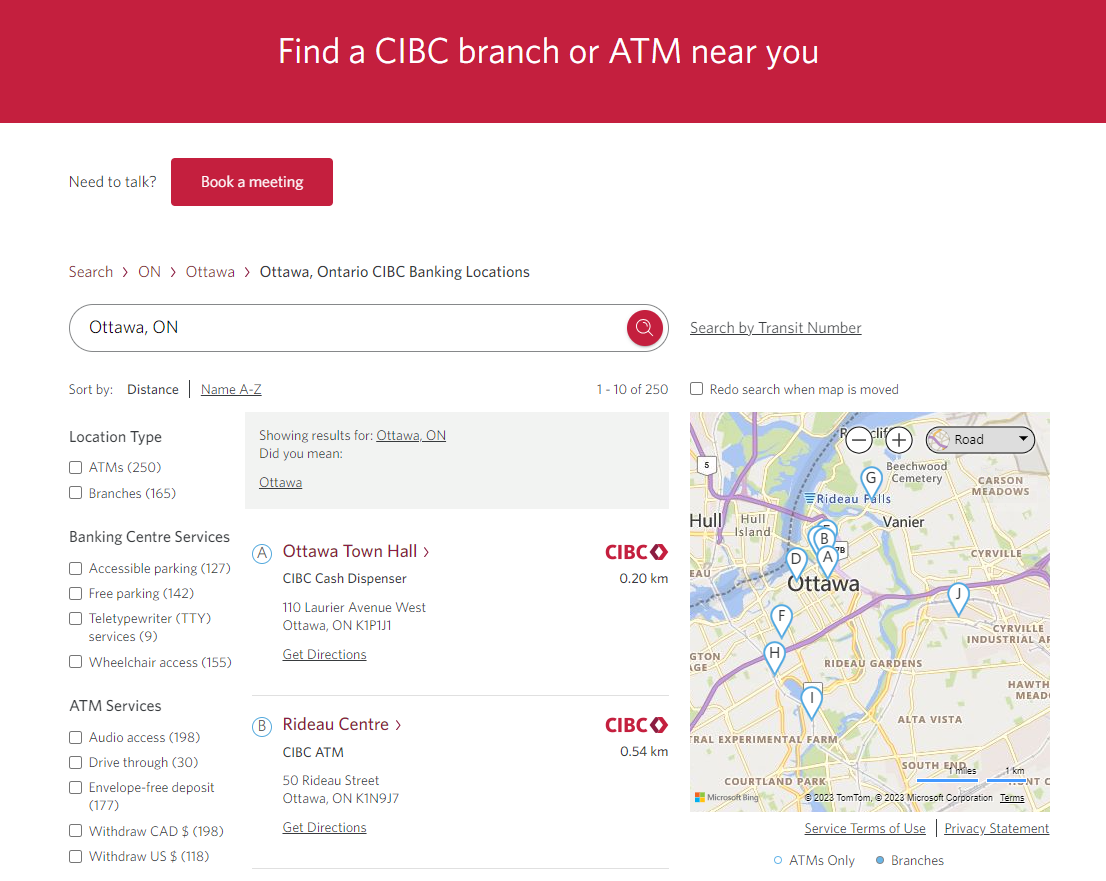
Not only does CIBC include a highly functional search feature, but it includes advanced filtering in order to find a nearby location with a drive-thru, for example. It also visually differentiates between full branches and CIBC ATM locations. I especially like the inclusion of “search by transit number.” On the individual location pages, they also indicate “languages spoken” which I think is a really valuable touch.
Home Depot
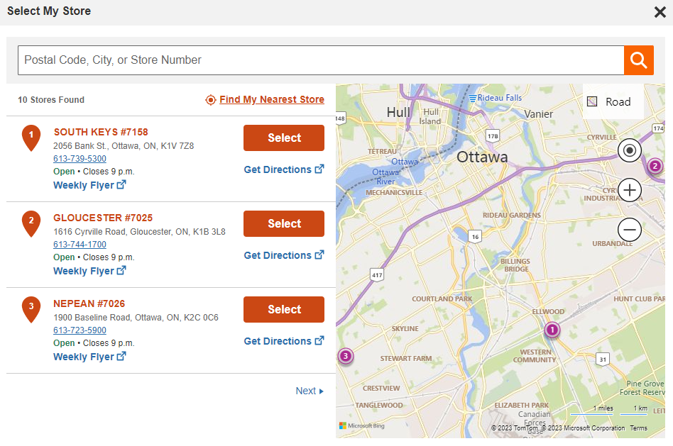
Home Depot has a pop-up that shows nearby stores, or you can search for a different location. Most of the inclusions are pretty standard, but I like the addition of a link to the weekly flyer specific to each location.
Boston Pizza
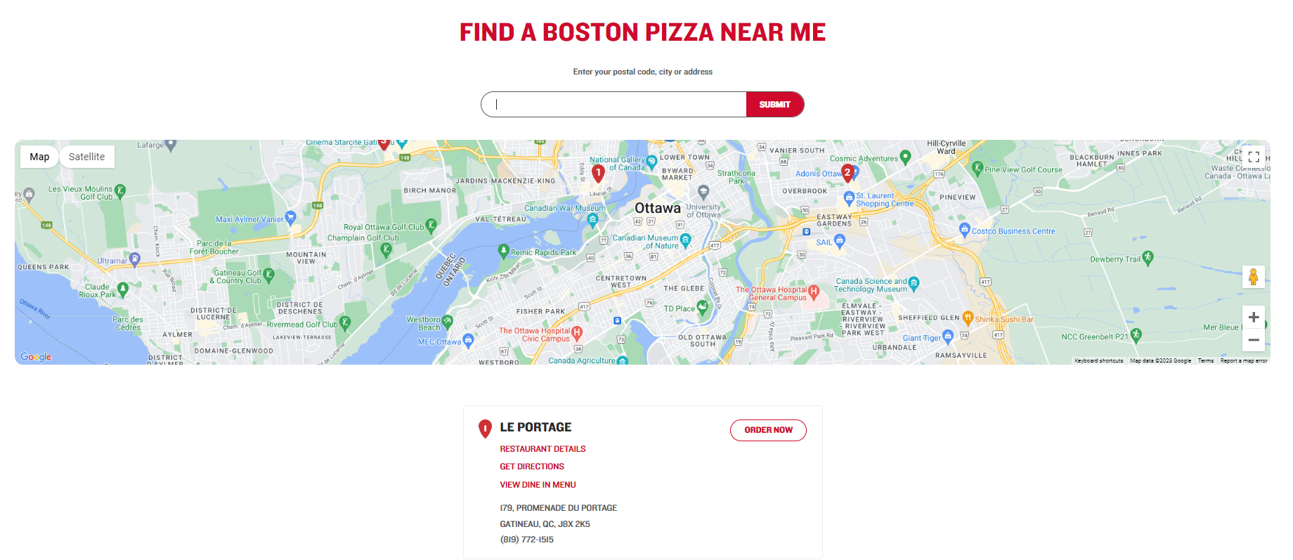
Boston Pizza has a very clear design, and you’ll see the individual cards don’t have as much information relative to other find a store locators featured here. Boston Pizza’s primary call-to-action (CTA) here is the “order now” button, prioritizing delivery orders over visits to the physical restaurant.
Old Navy
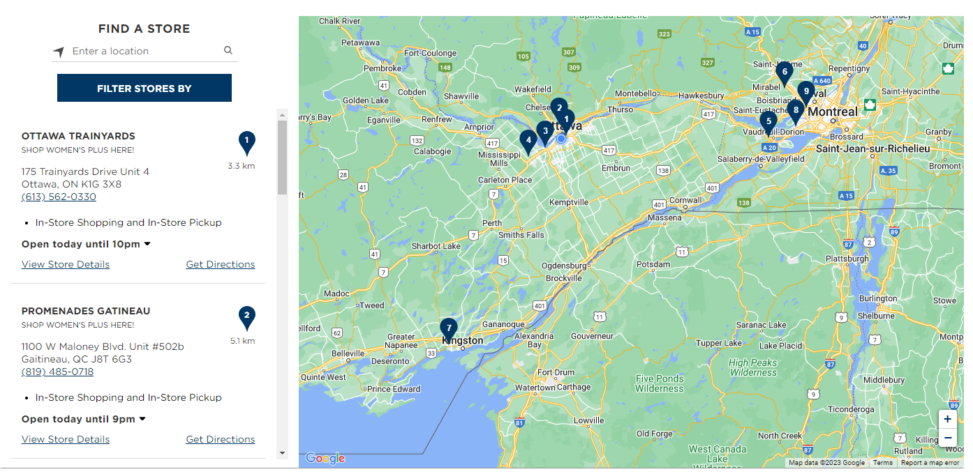
Old Navy has a standard locator. I find it interesting that by default it covers a wider geographic radius compared to the other companies evaluated here. Not many people would be willing to drive two hours away for a chain with the same inventory as local locations. I do like the inclusion of value propositions like “in-store shopping and in-store pickup” as well as highlighting inclusive attributes like the availability of women’s plus size clothing.
GoodLife Fitness
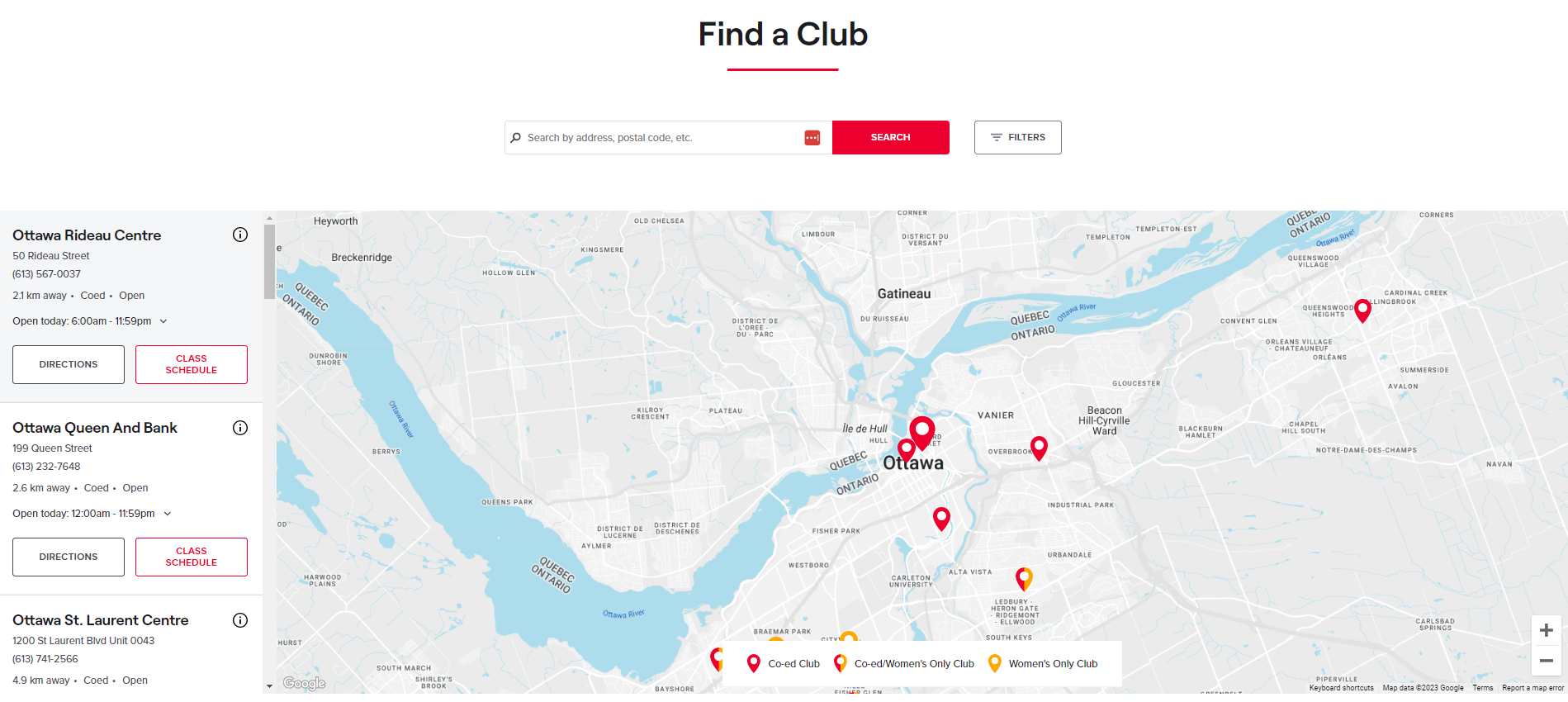
GoodLife Fitness includes two features that I really like. The first is a CTA pointing to the class schedule for each location. This shows they understand the user, because the most important factor in a gym-goer’s decision may not necessarily be proximity, but which location offers spin class at a more convenient time. Similarly, the inclusion of club type (coed, women’s only etc.) in the map legend is also valuable information for clients.
Store address & directions
Now that your customers have located a nearby store, lead them to the destination with detailed directions from their location. Some websites have integrated wayfinding, while others link out to third-party providers like Google Maps or Bing Maps.
CIBC
CIBC has built-in directions for vehicle, public transit, and walking. It even includes time estimates with real-time traffic updates. My only criticism is that it includes a default starting address of “Ottawa, ON” which it locates at Ottawa City Hall. This is not helpful for 99% of users, so the tool is only valuable if you enter your starting address manually. Still, compared to the other examples, this is the best on-site functionality by far.
Home Depot
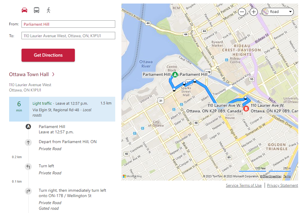
Home Depot’s “get directions” feature takes you off-site to Bing Maps. While this useful as you get access to Bing Maps’ full suite of features (like getting directions based on departure time, or adding more destinations), it feels disconnected from the Home Depot user journey.
Boston Pizza
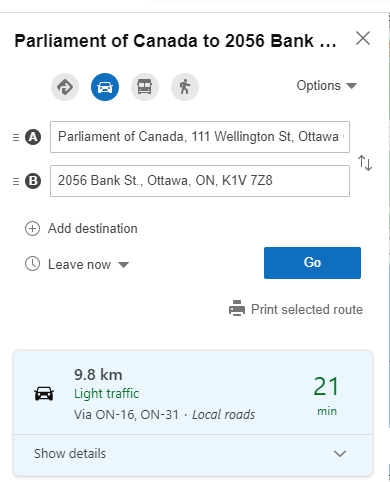
Similar to Home Depot, the Boston Pizza “get directions” button leads you to Google Maps. While it’s helpful that the destination address is auto-populated in both options, it’s not clear that there’s any advantage versus manually entering the address in your preferred maps app (which will also accept a destination like “Boston Pizza Gatineau” versus an exact street address).
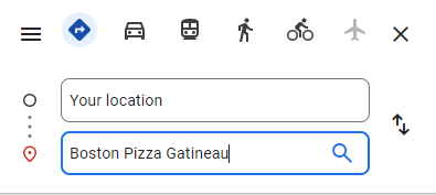
Old Navy
Old Navy also uses Google Maps to serve its visitors directions to the selected store.
GoodLife Fitness
GoodLife Fitness also uses Google Maps to serve directions.
Store hours
If you have limited store hours, you’ll want to communicate this to customers so they don’t show up to a locked door. If you have 24/7 availability, you’ll also want to advertise this as a value-add for convenience. Beyond regular hours, you can also reduce stress and uncertainty for your visitors by sharing holiday hours.
CIBC
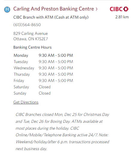
Not only does CIBC include branch-by-branch hours, they also make sure to include seasonal and holiday hours changes.
Home Depot
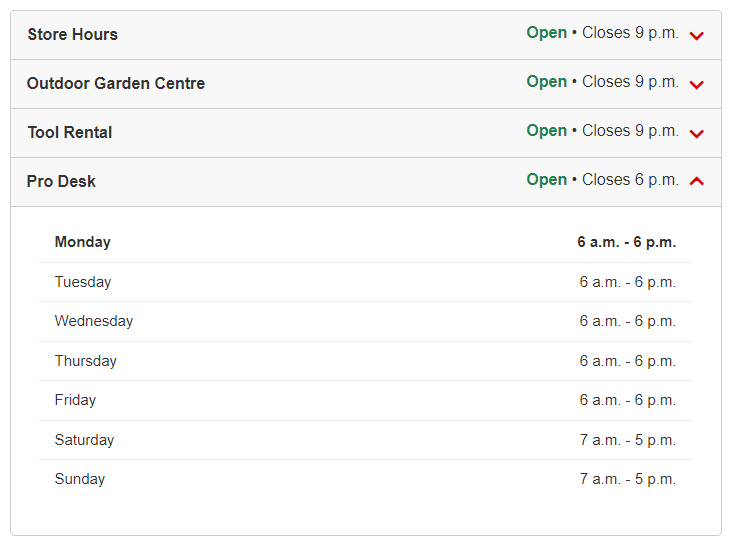
Home Depot provides hours for all services in a given location. As the hours are dynamic (showing “open” when open for business), the website also updates for holiday closures dynamically. However, there is no in-advance notice of holiday hours, which would be helpful for planning.
Boston Pizza
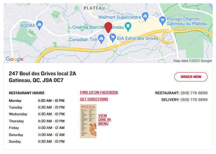
Regular hours are displayed, but they do not appear to be dynamically updated and holiday hours are not easily located. As well, it may be helpful to know if there are different closure times for in-restaurant dining, bar service, delivery service, and so on.
Old Navy
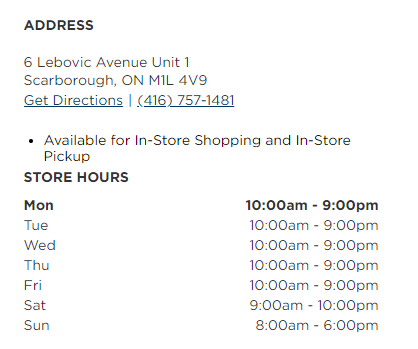
Regular hours are easily located but if holiday hours are available, they are not easily located store by store.
GoodLife Fitness
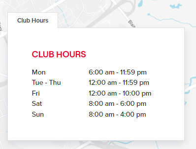
Club hours are clearly stated, but again holiday hours are not easily found if they are on the site. As well, it may be helpful to indicate if certain services are only available during certain hours of the day. As stated, a visitor can only assume that all services are available during business hours.
Store attributes
Not all locations are created equal. Some might have additional services (think: McDonald’s Playland) or inventory (think: a gas station Tim Hortons with no sandwich options). Publishing store attributes can help clients navigate to the most appropriate location for their needs.
CIBC
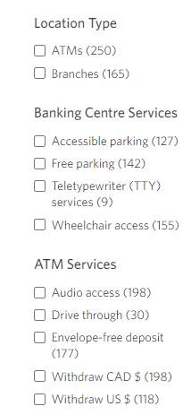
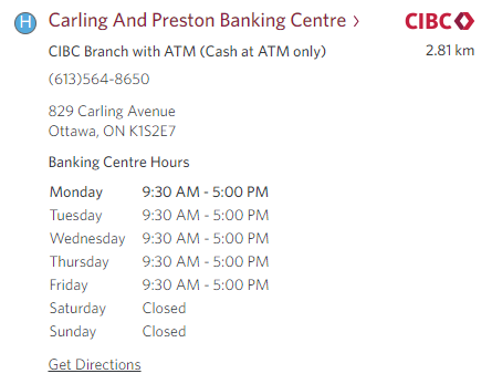
As mentioned above, CIBC has a detailed filtering system to help you find the right type of location. On each location card, they include this information so you know exactly what services are available.
Home Depot
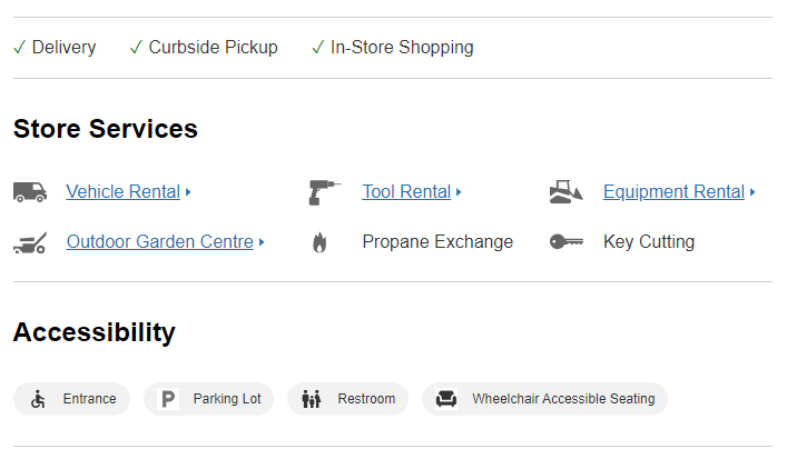
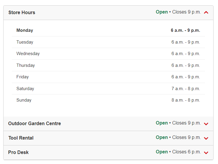
Home Depot has a ton of information for their individual locations. Here you can see not only transaction options (delivery, curbside etc.), specific store services like key cutting and propane exchange, but also accessibility details. I also like that the store hours are broken out by service. My only criticism is for services that could reasonably be considered seasonal (like Outdoor Garden Centre)—it would be reassuring to see a date reference like “winter hours,” so I know that it’s not just outdated information from peak season.
Boston Pizza
In contrast, Boston Pizza does not have anything clearly distinguishing for individual locations. It would be nice to know, for example, which locations have a patio, or which have a private party room. It may be that these features are at all locations, but it would still be valuable to indicate. This is especially important if comparable restaurants clearly indicate such attributes on their websites; if so they might sway the decision of that parent trying to plan a birthday party.

Old Navy
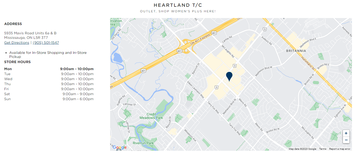
As mentioned above, the “Shop Women’s Plus Here!” callout is helpful, and they’ll also distinguish if it’s an outlet location as seen in the example below. It feels like there is room on the table for more details. For example, if not all stores offer dressing rooms, or if one location is known for its extensive activewear inventory, it would be good to see this. However, it’s also possible that Old Navys are virtually identical in terms of layout, services, and features.
GoodLife Fitness
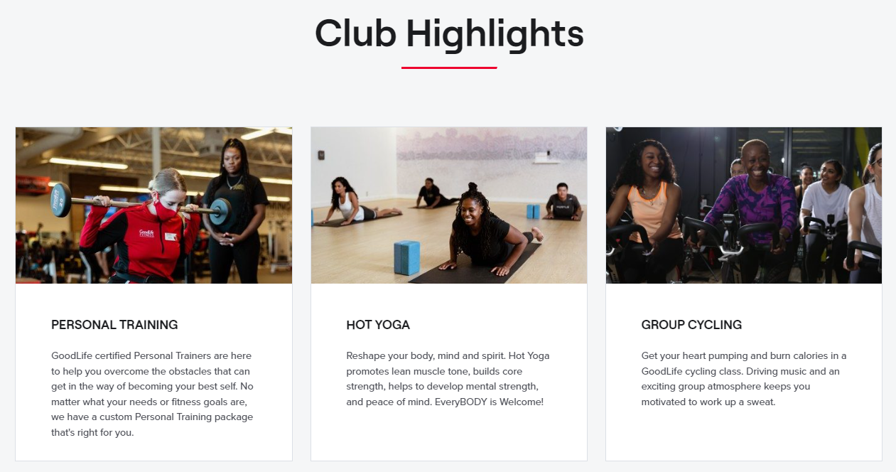
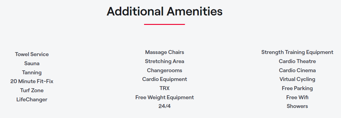
GoodLife has very detailed location pages that list out all the available facilities and amenities. Some of these are “nice to haves” like free parking and free wifi, while others are core to a member’s workout regimen (like an on-site swimming pool or group cycling classes). It feels like the only thing missing is accessibility information.
Integrated contact options
Whether it’s a visible “Contact Us” button or a chat widget, this feature ensures that customers can easily reach out for inquiries, support, or feedback, enhancing overall satisfaction and accessibility. From a digital perspective, these trackable actions also make it much easier to measure relative performance by location. As a digital marketing agency, we use these insights to improve conversion rates and other performance metrics for multi-location clients.
CIBC
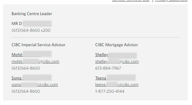
CIBC provides general phone, fax, and toll-free contact information for each branch, as well as phone/email contact information for managers and specific advisors. This is very helpful and detailed, but there is no built-in live chat or contact form functionality to connect with an individual branch virtually.
Home Depot
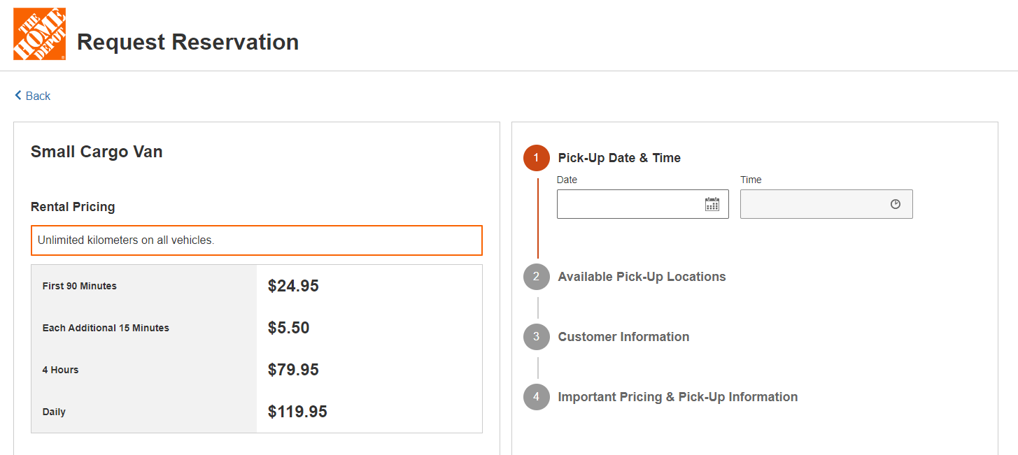
The website provides phone details for the main store line, as well as specific desks/services. However there is no live-chat or contact form functionality to submit a message to the store in general. That said, there is a store-specific booking form functionality for vehicle and equipment rentals.
Boston Pizza
The website provides phone information for the restaurant and delivery lines. There is no live-chat or contact form functionality, but there is online ordering integration.
Old Navy
The store phone number is provided, but there are no other contact mechanisms integrated onto the site.
GoodLife Fitness
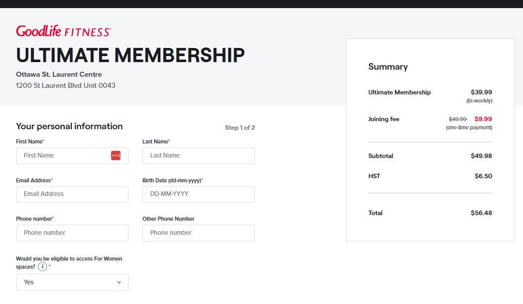
A store specific phone number and email address are provided for each club. There is a registration form for membership, but no other integrated contact options available on the site.
Conclusion
The components I’ve explored in this blog form the backbone of a seamless and reliable user experience for multi-location websites. Consider your own website—how does it stack up? Do you have the required features for your users or is there room for improvement? If you’d like an expert perspective, reach out to our team for an audit and we can provide actionable insights to help improve your website.
