Accessibility is an essential consideration for developers and organizations who want to create high-quality websites and web tools that don’t exclude anyone from using their products and services. A strong focus on accessible design will improve both the overall user experience and satisfaction for users of all ages, in a variety of situations, and across different platforms and devices.
Here are five ways you can make your site more accessible:
1) Ensure that all images have a descriptive, unique ALT text:
Firstly, what is ALT text? ALT text stands for Alternative Text and is the key to understanding what image content is on a page if you cannot see the images. Sometimes this may appear when an image resource fails to load, or if the original image file is unlinked. Your ALT text does not have to be very detailed – it simply acts as a short, simple, description of an image. It should be descriptive, but not easily mistaken for another photo on the site i.e. no repetitive ALT texts).
Some common approaches to creating ALT text might be to isolate specific features of the image; who or what is in the foreground, is an action being performed, and is there essential information in the background?
Use the following image as an example:

- In the foreground, the woman is sitting at a desk, and she is working on a laptop
- In the background, four colleagues are chatting.
A few words is usually enough, though sometimes a complete sentence is necessary. Remember, screen readers may cut off ALT text at around 125 characters; so it is suggested to stay within that limit. Unnecessary information like what the people in the background of the shot are wearing or doing can be excluded. You want to give just enough information to describe the image but not distract from the actual content on the site.
Tip: If the image is from a stock photo website, you can usually use the title with a bit of editing as the ALT text
| Bad ALT Text – Too Short Woman sitting at a desk with a laptop | Bad ALT Text – Too Descriptive Woman sitting at an office table with a laptop, smiling at the camera with her fingers on the keys. In the background, four colleagues are talking, one is holding a folder and another is holding a coffee… | Good ALT Text Woman sitting at the office table working on a laptop with a group of colleagues in the background |
2) Colours have enough contrast
Following the WCAG 2.1 (Web Content Accessibility Guidelines), elements must have a contrast of at least 4.5 : 1 to comply with Level AA and 7 : 1 for Level AAA.
One of the easiest ways to test for colour contrast is with an online tool such as Colour Contrast Checker. The Colour Contrast Checker tool looks for the difference between the tonal values, perceived “luminance,” or brightness of the colours selected. The value of a colour is the lightness or darkness of a colour and defines a colour in terms of how close it is to white or black. The further away on the tonal spectrum two colours are, the more contrast there is. For example, white on black has the highest contrast ratio (21 : 1), and white on white has the lowest (1 : 1), but as you add colours into the mix, they move closer to the mid-range of the tonal spectrum.

There are a few exceptions to the WCAG 2.1 level AA and level AAA contrast ratio, such as:
- Large Text: Text larger than 20px must have a contrast ratio of at least 3:1
- Incidental: Text that is part of an inactive user interface component, that is pure decoration, that is not visible to anyone, or that is part of a picture that contains significant other visual content, has no contrast requirement.
- Logotypes: Text that is part of a logo or brand name has no contrast requirement.
3) Background images and text should have enough contrast when used together
When using text over an image, which is commonly seen in hero sections, it is crucial to ensure there is enough contrast between the various colours in the images and the colours of your text.
Here are a few ways to ensure the colour contrast is readable:
Include an overlay
Adding an overlay to your hero image can help to either darken or lighten the image and add contrast, which is one of the most commonly used solutions on the web. With this option, you must confirm that the overlay has enough opacity to provide the correct contrast. For example, the following hero section would be considered inaccessible if we were to only add the black or white text over the image.
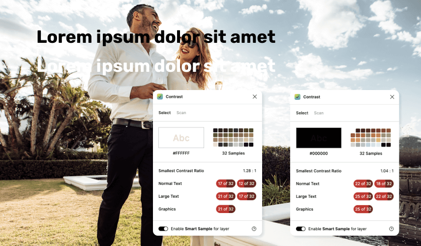
Adding an overlay of your desired colour will help even out the various colours in the image, giving more contrast to the text above. The most common implementation is using a dark overlay with light-coloured text or vice versa. It is generally the easiest approach to getting the correct contrast ratio without sacrificing the quality of the image with too heavy of an overlay.
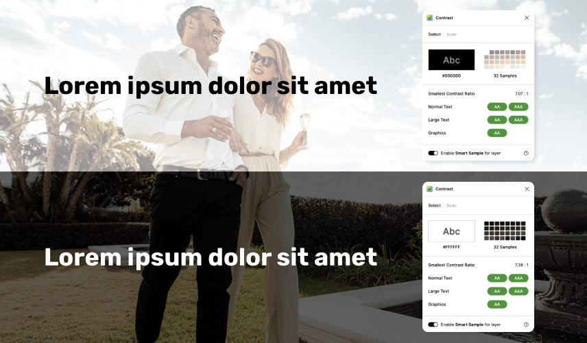
With this implementation, it does become more challenging to use colours that aren’t pure black or white. As the tone of a colour gets closer to a mid-range grey, it will become more difficult to have an overlay that passes accessibility requirements once the opacity is lowered. In the example below, the overlay has to be far more opaque than the example above to pass level AA and even then, it doesn’t pass level AAA requirements.
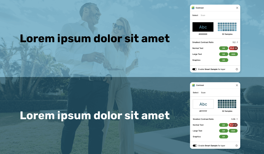
The key to this implementation is ensuring that your overlay colour and text colour pass with a high contrast ratio; making the background colour translucent will lower the contrast ratio between the two colours. Choosing highly saturated colours on opposite sides of the tonal spectrum will make this the ideal solution.
When confirming that the image, overlay and text has enough contrast, l always use Contrast, a Figma plugin with Smart Sample abilities. This feature samples the colours from background images and gradients behind a selected text layer and outputs a pass or a fail depending on how many of the different areas were compliant. Each example above displays this feature.
Opaque to transparent gradient
Using a gradient that starts with a solid colour behind your text and then fades out to show the image is a great way to avoid the fussiness of the image colours interacting with the overlay and text colours. For this implementation, you need to ensure the main gradient colour is accessible with your text and that at different screen sizes, the solid part of the gradient remains entirely underneath the text to remain readable.

Colour blocking
Colour blocking is adding an opaque or translucent background to help contrast the background image and the text. This is the easiest way to ensure proper contrast between the two elements. If you use a completely opaque background colour here, it will provide more flexibility in using colours other than black or white since you won’t need to worry about the interaction between the background colour transparency, the image, and the text.

4) Aria-labels on buttons / links / form fields
Aria-labels (Accessible Rich Internet Applications) are tags in your website’s code used to describe the purpose of an element when there is no visible label. They can also be used to give more context for the action that will be taken.
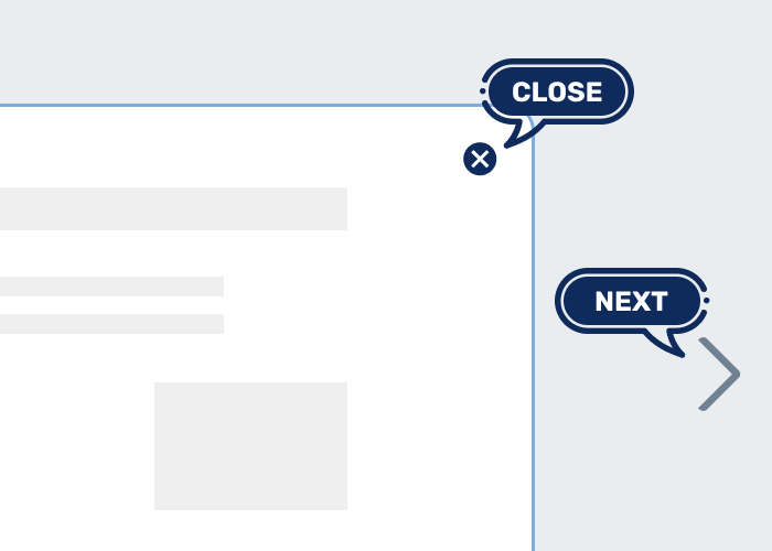
For example, the X used to close a popup window would require the aria-label of “Close” to give screen reader users more context over what the button does.
An aria-label should be concise and explain an action in as few words as possible.
For example, you have a slider with arrows, the next slide arrow doesn’t need to say “Arrow to the Next slide”, it can simply be labelled as “Next” as other context clues will tell the user that they are on a slider. For some items, the aria-label does need to be a little more descriptive. For instance, a social icon that links to a company’s Twitter could be labelled as “Link to our Twitter.”
Items that need aria-labels
- Close buttons with only an X visible to the viewer as text
- Buttons that are just icons, i.e. sliders pagination or arrows, next pages on blogs, hamburger menu icons, social icons
- Input fields that don’t have visible titles
Items that do not need aria-labels
- Buttons with descriptive text like “Click here to go to the home page “
- Links that are text
- If the element itself already has text content
- Input fields that contain titles and labels
5) accessiBe
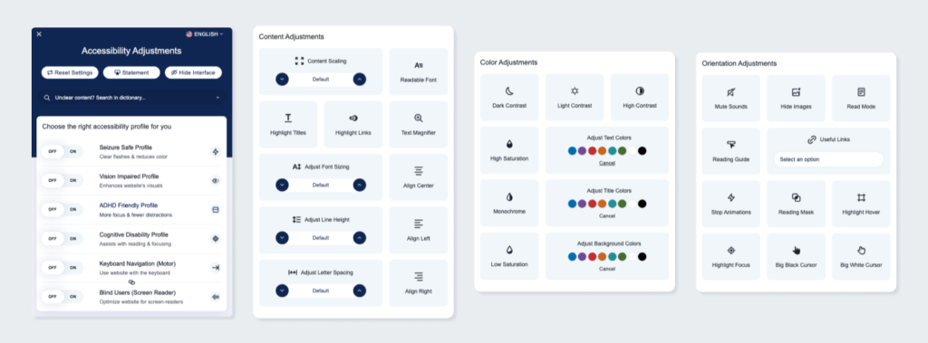
What if you don’t have the ability to make these adjustments to your site? Solutions like accessiBe can resolve accessibility issues by simply installing a widget on your site. While it comes with a cost, the automated web accessibility solution can fix critical issues across your entire site with little effort from you.
When the widget is added to a website, it applies JavaScript to adjust the frontend interface and AI to modify the background code of a site’s contents to make it accessible.
The accessWidget’s interface is a session-based design and UI adjustment tool, allowing users to change colours and contrasts, stop animations, and highlight key headings, links and navigations. The accessWidget’s machine learning processes run in the background and analyze the code to add alt tags to images, aria-labels to inputs and buttons or give users the ability to use a keyboard to reach any page with a single keyboard selection.
Want to test accessiBe for free for 7-days on your website? Try it out here.
Want to learn more about Web Accessibility? Read our blog on the importance of web accessibility.
Helpful resources
- Colour Contrast Checker: Compare the contrast ratio of 2 colours, background and foreground, within a webpage against level 2 of the Web Content Accessibility Guidelines (WCAG).
- The A11Y Project Accessibility Checklist: The A11Y Project is a community-driven effort to make digital accessibility easier, their fully comprehensive checklist helps you Q/A your projects and sites for possible improvements.

